Psychedelic Art, The Beauty of Everyday Things and Cosmic Whirl
By Smyra Arora
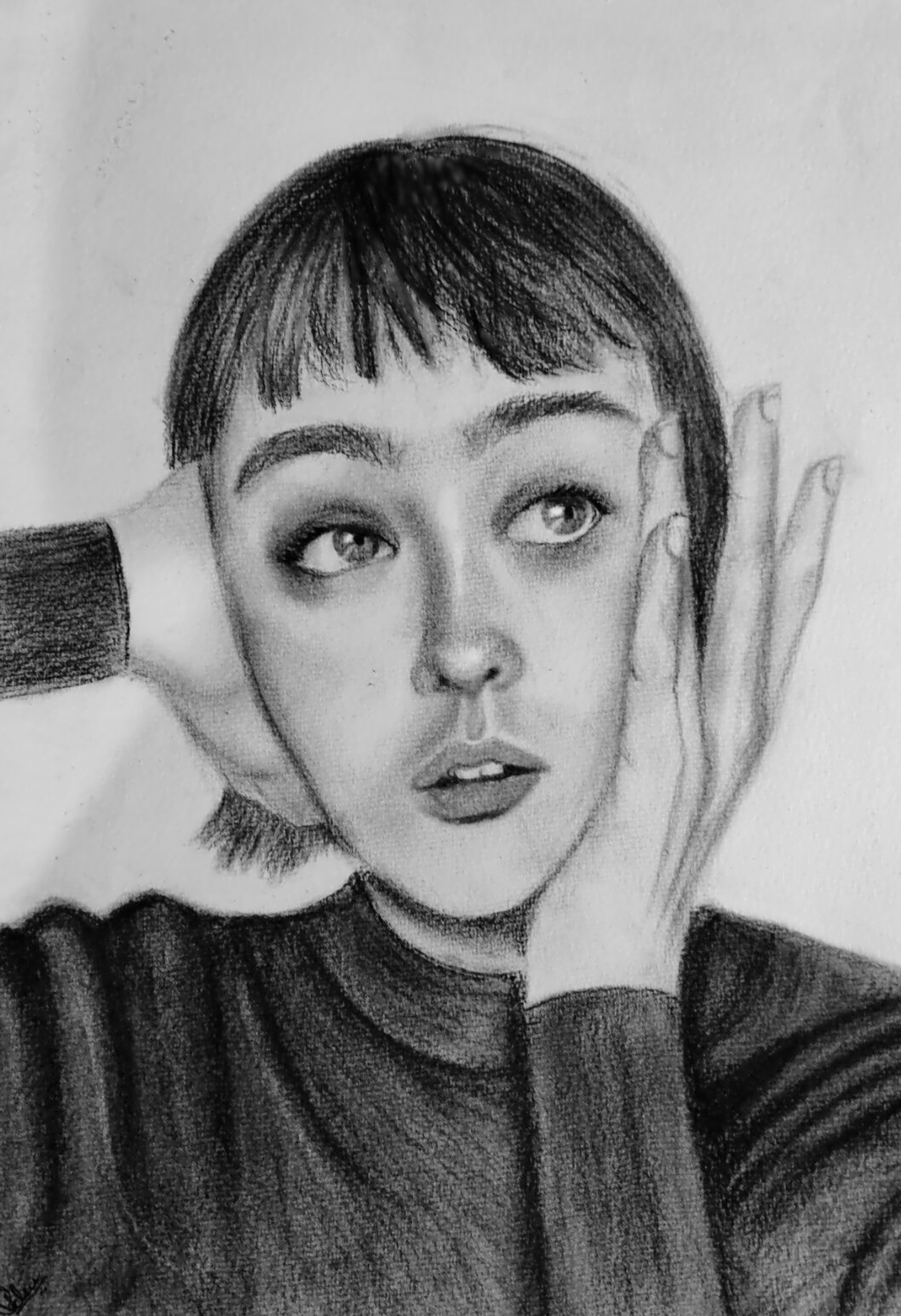
Hi, my name is Smyra Arora, I’m 18 years old, and I’m a first-year design student at Goldsmiths, University of London. I
love to draw and paint—not necessarily to create masterpieces, but simply as a way to unwind and relieve stress. Being
creative brings me a lot of happiness, and these are just three drawings that show my creative side.
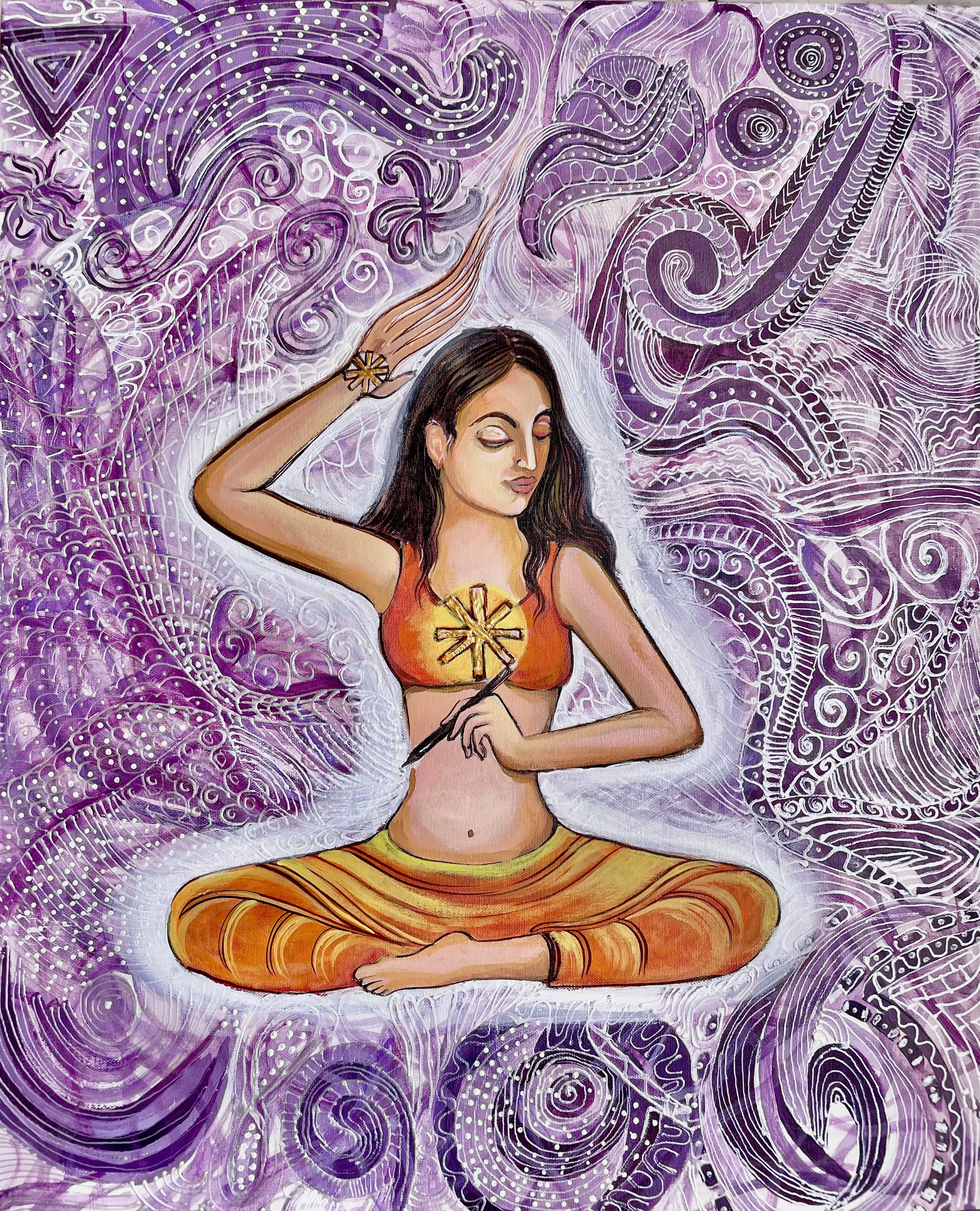
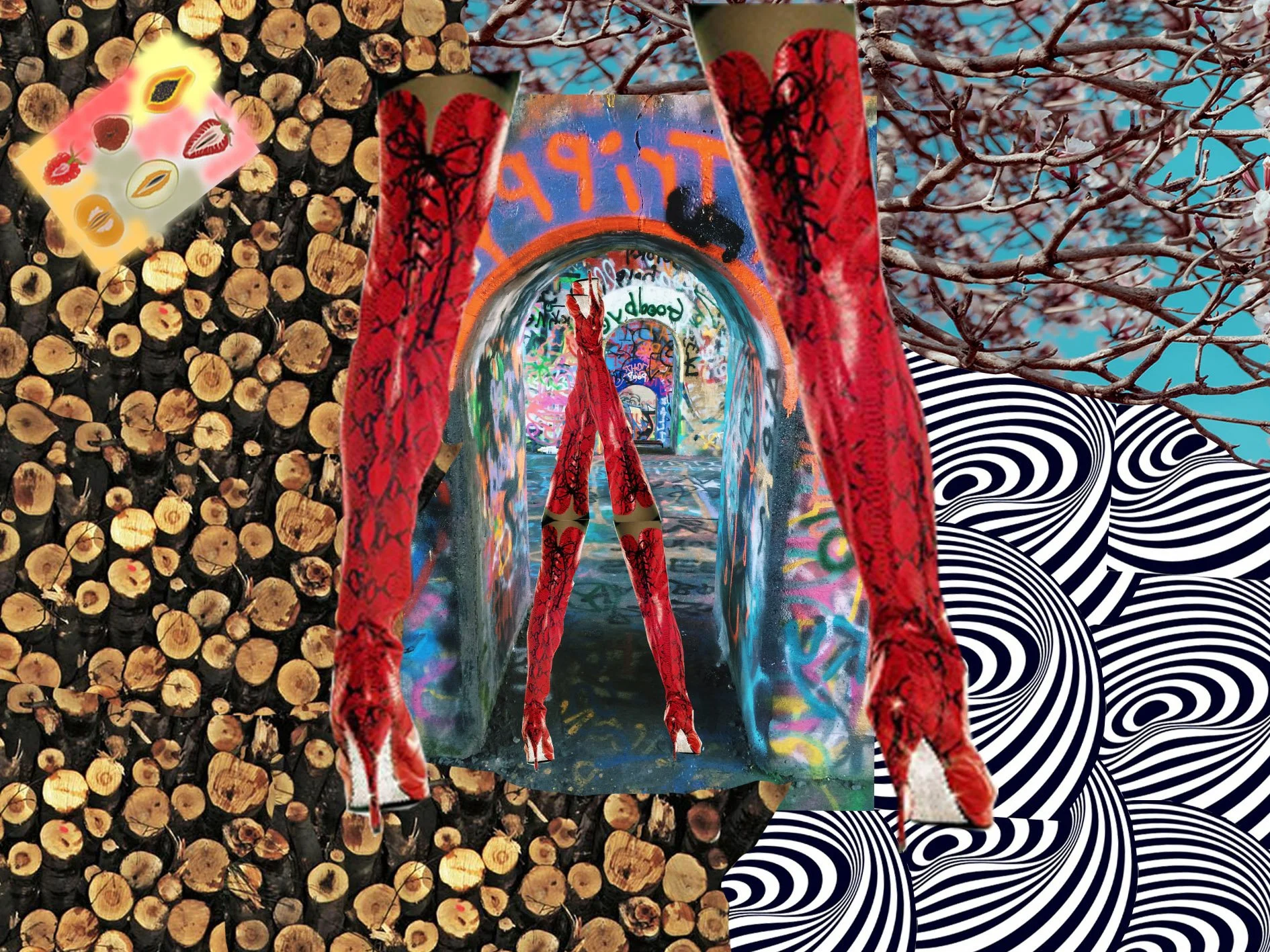
Psychedelic Art (first)
This painting represents psychedelic art—a colorful and surreal style influenced by experiences with hallucinogenic substances like LSD and DMT, known for evoking vivid and mind-bending visuals. The term “psychedelic” itself means “mind-manifesting.”In this artwork, a girl is depicted writing, symbolizing the idea that we each hold the pen to our own futures. It emphasizes that, while external factors may influence us, we have the power to shape and transform our own circumstances. At the centre of the composition, the charkha (spinning wheel) represents independence and self-reliance, reinforcing the notion that true strength lies in depending on oneself.
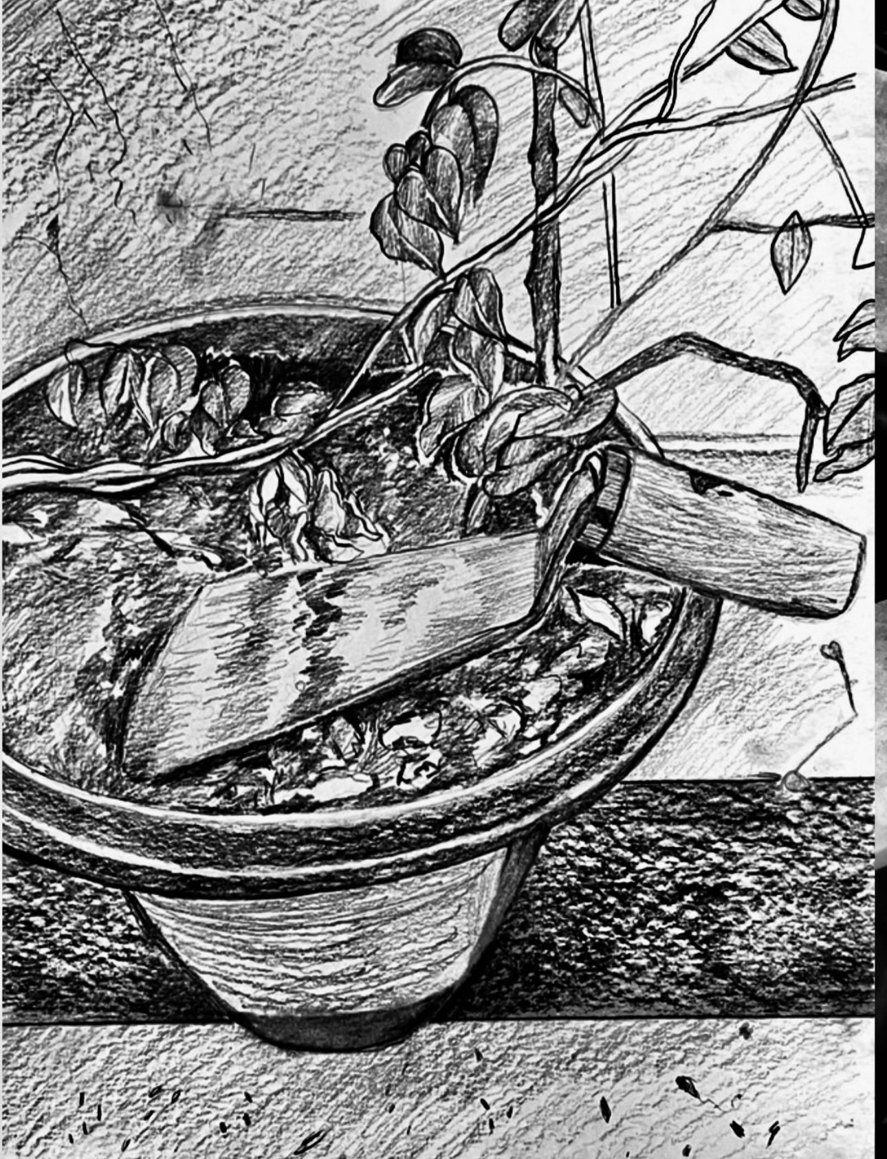
The Beauty of Everyday Things (second)
Every day in our lives, we observe countless objects around us, whether inside our homes or outdoors. These objects may be natural, living, or man-made; however, we often overlook the unique characteristics of the things we see. This artwork is inspired by my observation on my balcony. The plant depicted here is the Butterfly Pea, also known as Aparajita. This plant is a creeper, requires attentive care, and offers numerous medicinal benefits.
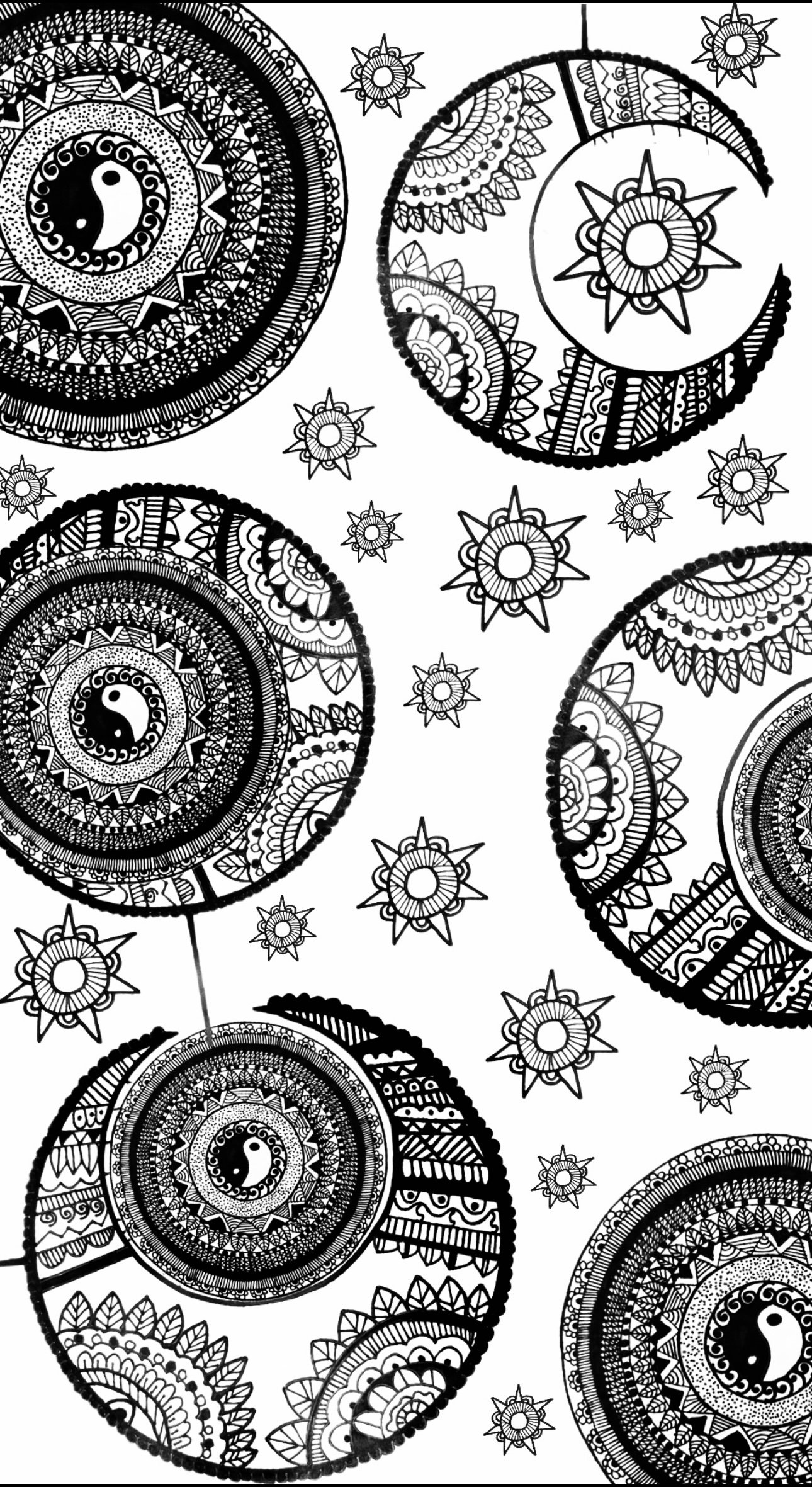
Cosmic Whirl (third)
This artwork is a mandala- a geometric designs that represent the universe in Hindu and Buddhist symbolism, often used to promote focus and meditation. This piece incorporates patterns resembling moons and stars, symbols I’m especially drawn to and enjoy.
Editor’s Note- Smyra’s art displays a myriad of different skills, from the bright colours of her psychedelic piece, to the shadows of her plant pot. Her art showcases her skill, ability and talent at different forms of illustration and drawing.


Monologue
by Essieme

by Essieme
Essieme is a freelance graphic designer and illustrator who seeks opportunities to expand their areas of interest in the art field. They run a personal art page, mainly publishing digital illustrations and short comics. Currently, they are also experimenting with mix-media installations, tufting, and tapestry weaving while searching for further inspiration and ideas.
edited by Maria Riga
Baby’s first existential crisis
by Lisa Gaultier
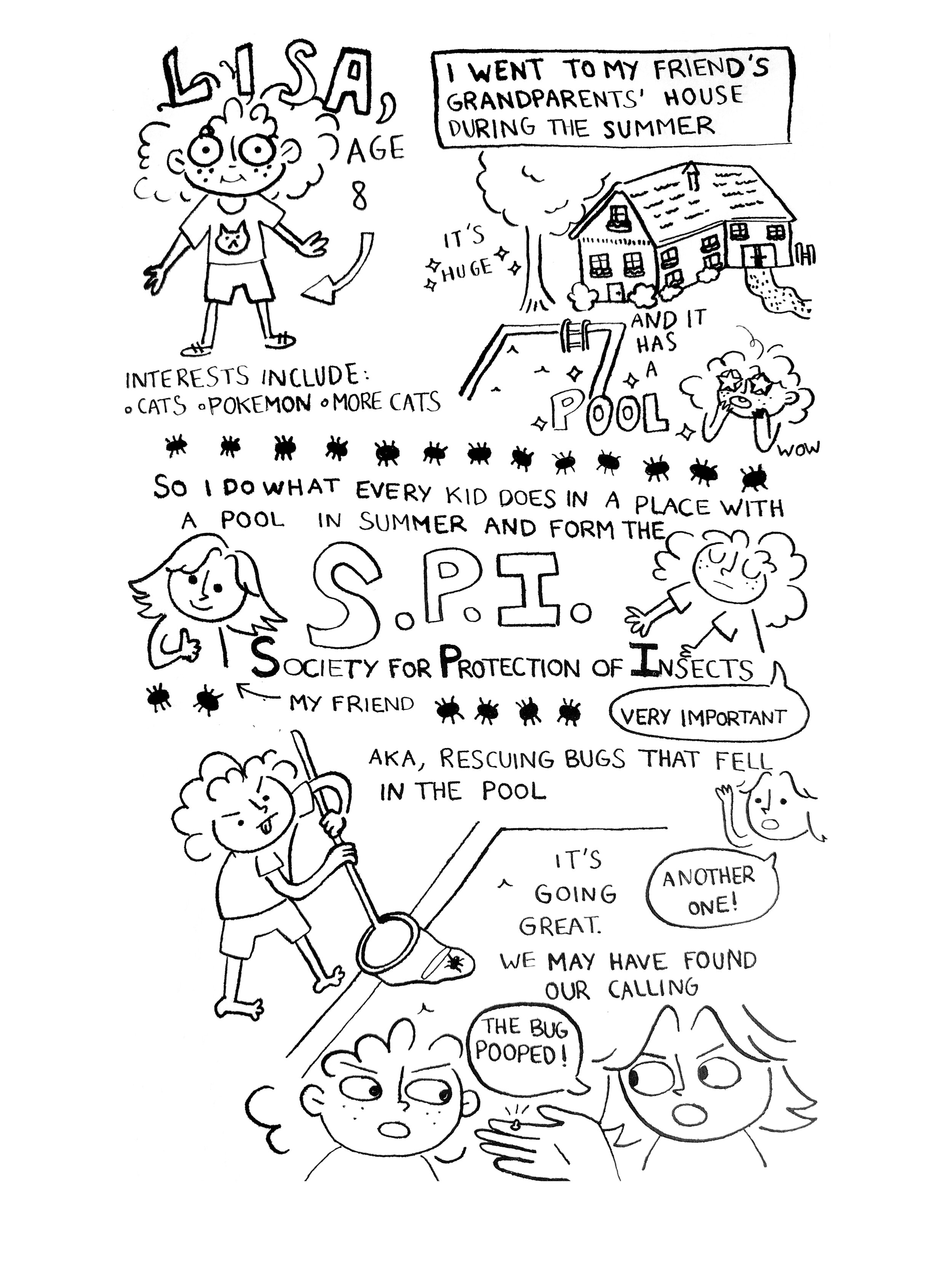
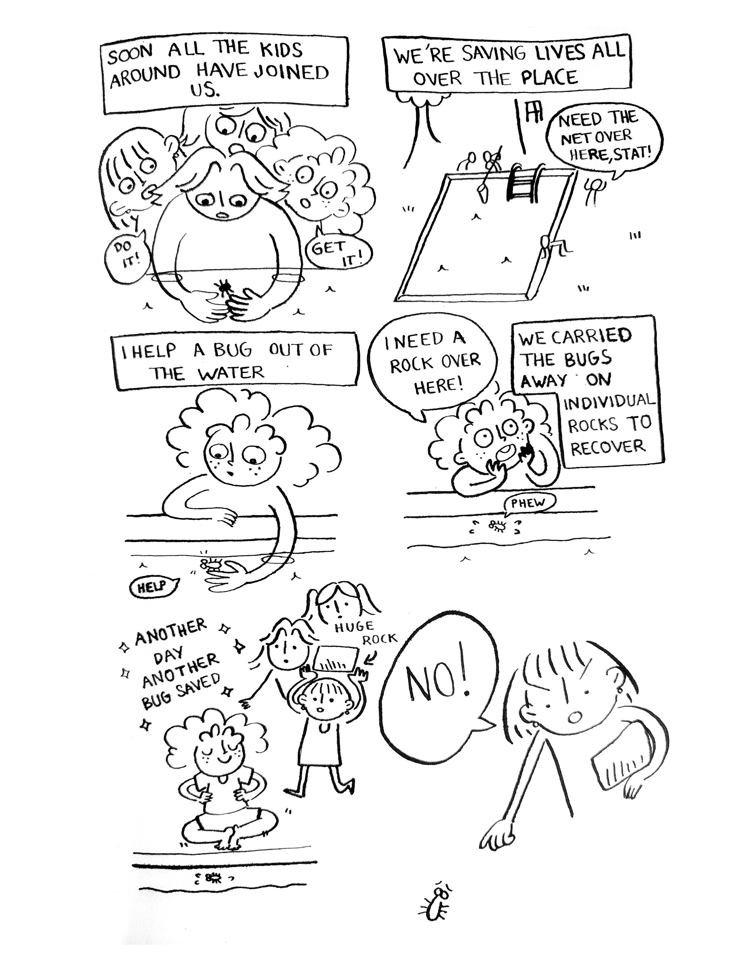
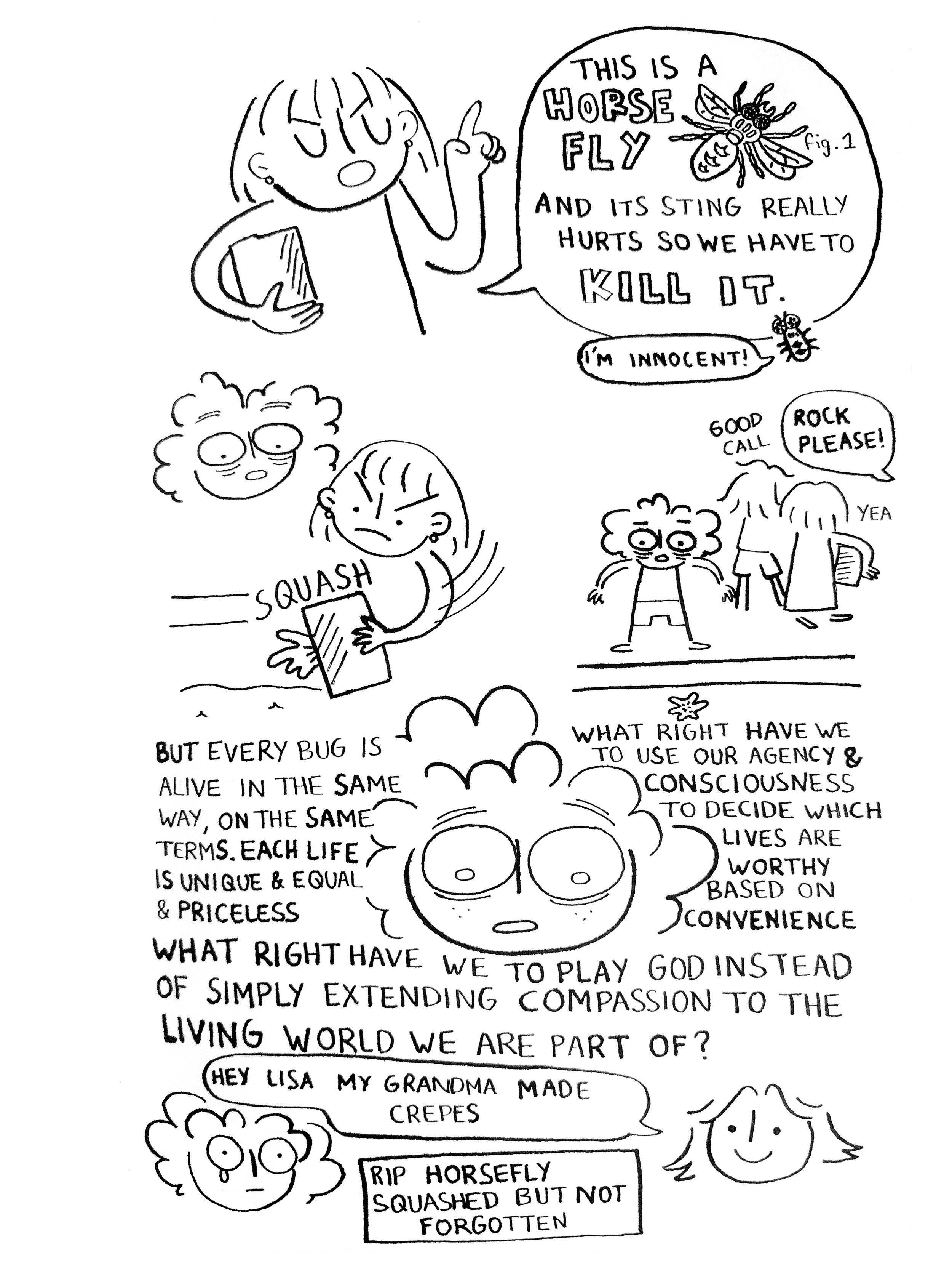
by Lisa Gaultier
My childhood memories are a place of nonsense. All the milestones, the betrayals, heartbreaks, losses, the stuff you tell your therapist, tend to be stored in the back of the store, employees only, not for my own eyes. A memory stew of repression I vaguely know the ingredients of. What I do remember is this little squashed bug. It's strange to think it's most likely no one else in the world remembers this horsefly. Gone is my first day of school, the best friend that moved away, my parents separating - this was when I realised that we had power of life and death. The life bit I enjoyed, the saving bugs bit. But I could also squash a bug, ruin a life, hit someone over the head with a frying pan if I wanted... and there wasn’t much to stop me but myself.
That stung (pun intended).
Lisa has a BA in Creative Writing and Film. She enjoys writing short stories as well as scripts, and drawing plays a significant role in her creative process. She writes wacky, colourful comedies, usually with a dose of absurdism and talking rats. She’s very interested in issues of representation and politics in mainstream film and TV, especially about women and LGBT+ issues.
Twitter: lisa_gaultier

Impostor Syndrome
by Natalya Mykhaylyuk
by Natalya Mykhaylyuk
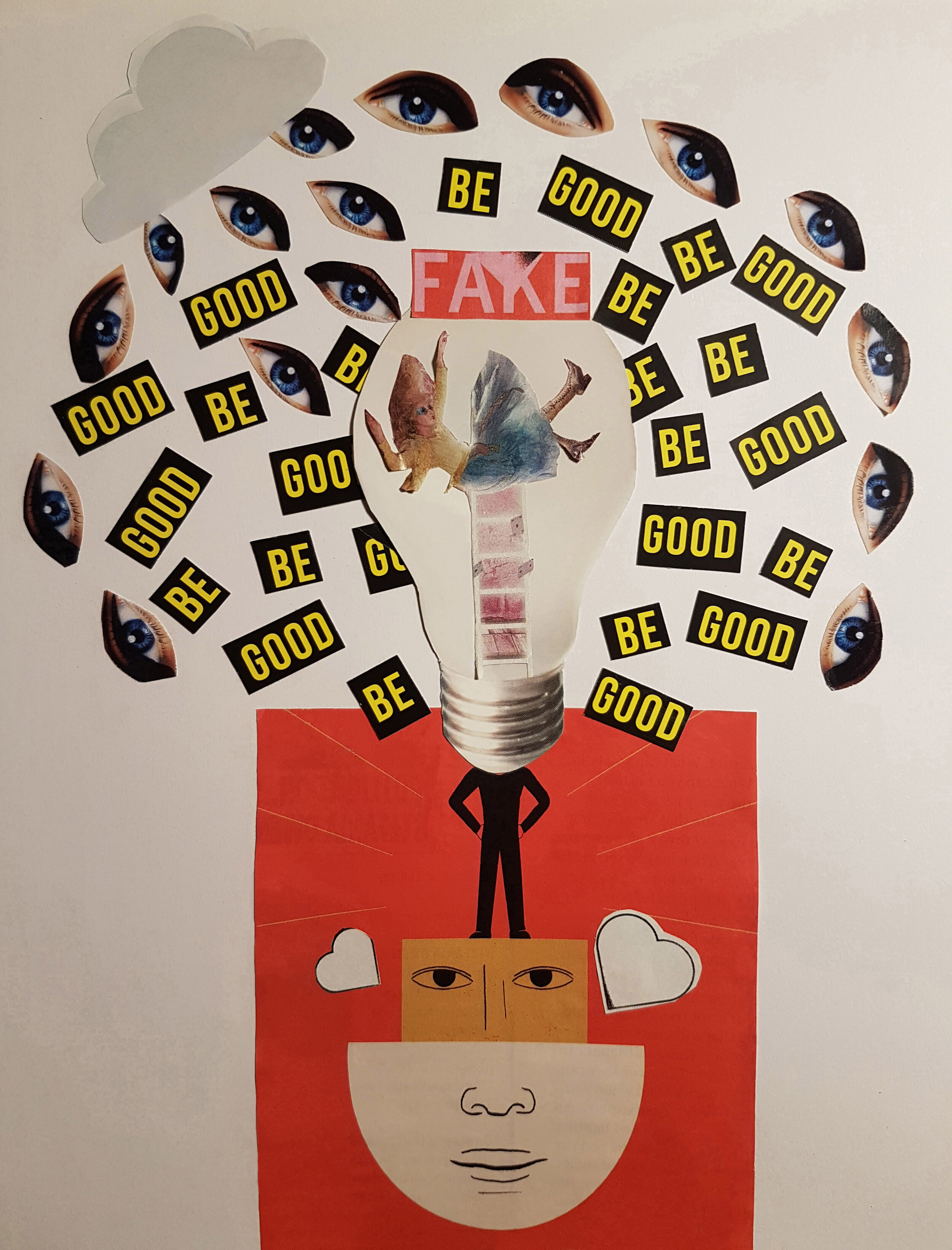
“This collage explores Impostor Syndrome. Many people have experienced it at some point in their lives. It's the little voice inside a person's head that tells them they’re not good enough, making them doubt their achievements.
In the collage, a person appears triumphant on top of the podium, having achieved success.
But inside their head they hold the idea that they're failing to "Be Good" enough, believing themselves to be a "fake" or a fraud. They fear that they're not as competent as others perceive them to be. This critical voice follows them like a rainy cloud.
But it's one voice of many, only amplified when we chose to believe it and give it our attention. The podium is a face and its pinnacle the head precisely because our sense of achievement is a matter of perception.
If we exit our head for just a little while, we'd be able to see with more perspective, finding the compassion to be less harsh on ourselves, recognize our true worth and celebrate our achievements!”
Natalya is a writer/director who’s just graduated with an MA in Filmmaking (Directing Fiction) from Goldsmiths University. Passionate about character-driven stories with unexpected twists across different genres, her films deal with themes of perception and the blurring of boundaries. She recently co-wrote and directed SOUR, a dark comedy horror exploring one woman’s rather unusual experience of lockdown... whilst isolating with a sourdough starter! You can find out more about SOUR and her other projects on www.natalyamykhaylyuk.com and @natalyamykhaylyuk on Instagram.
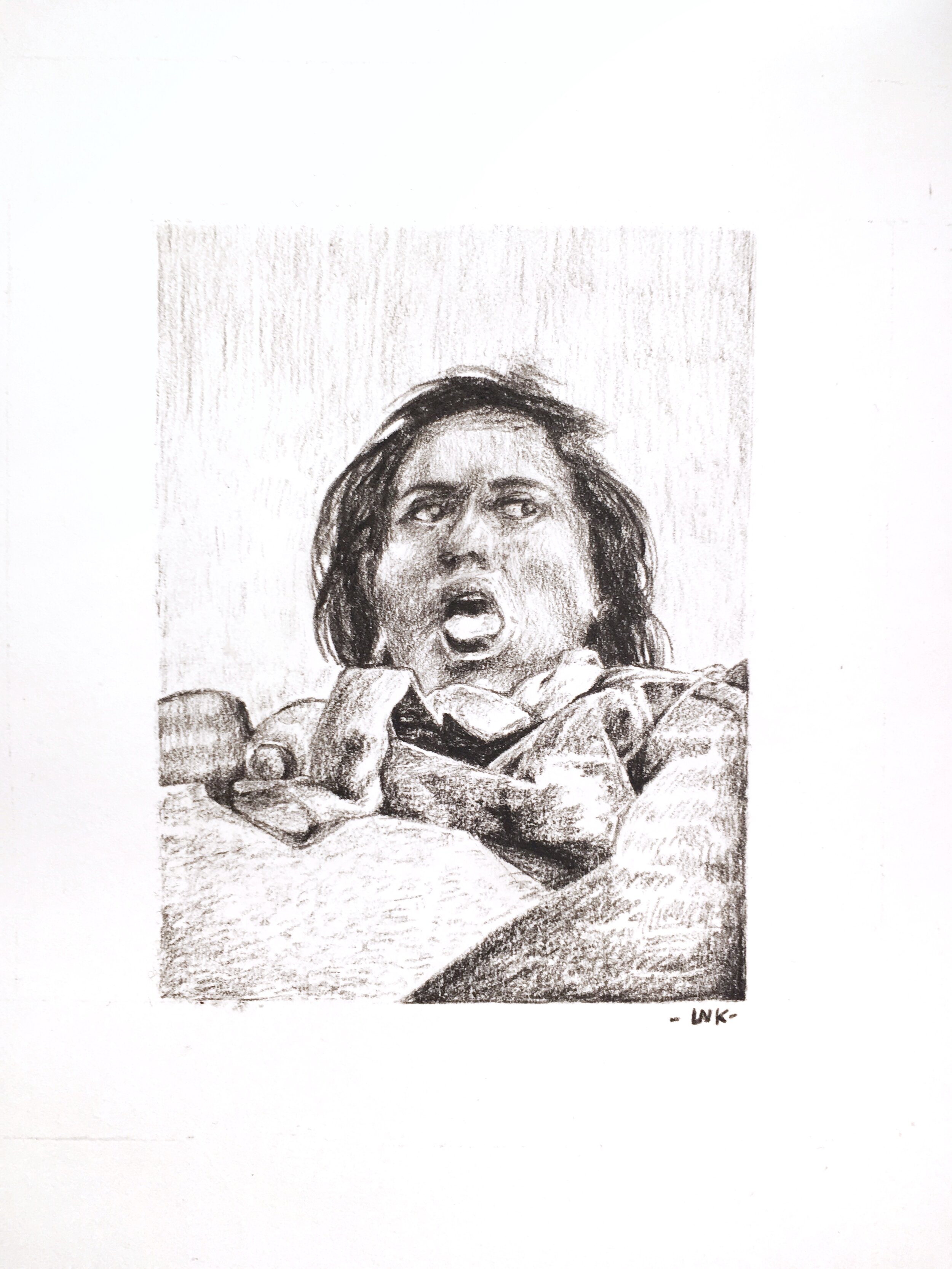
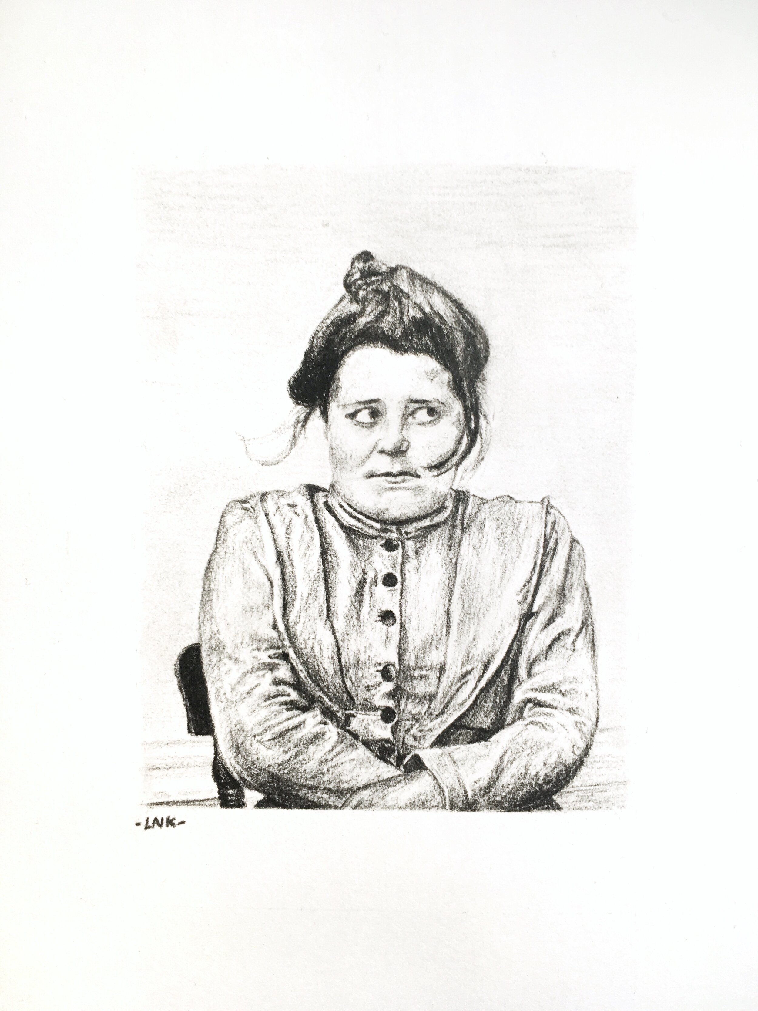
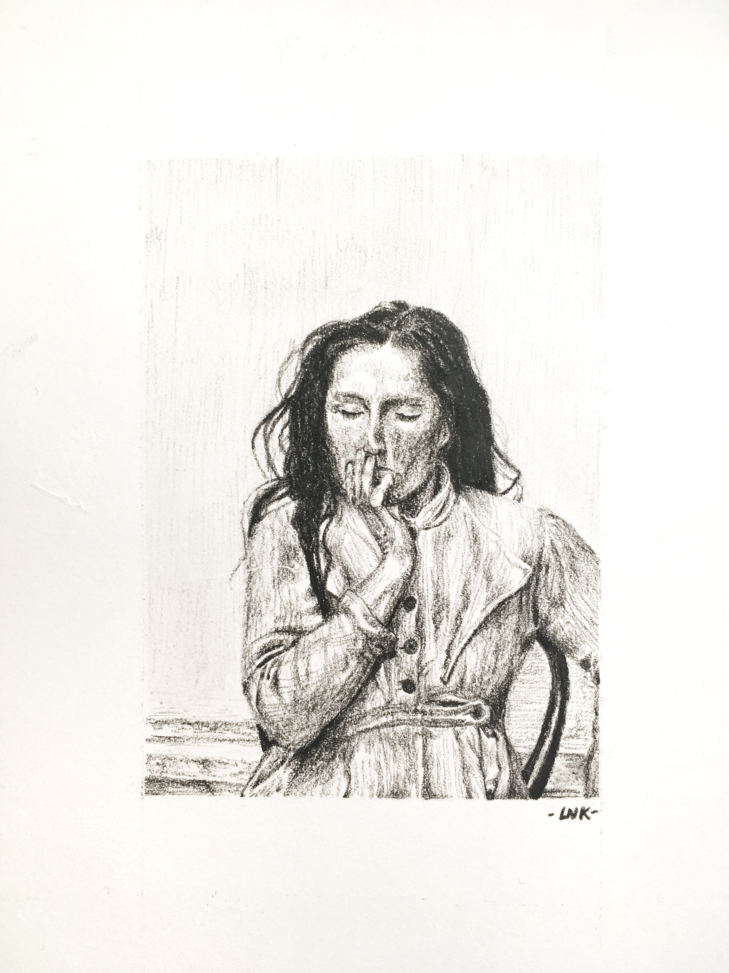
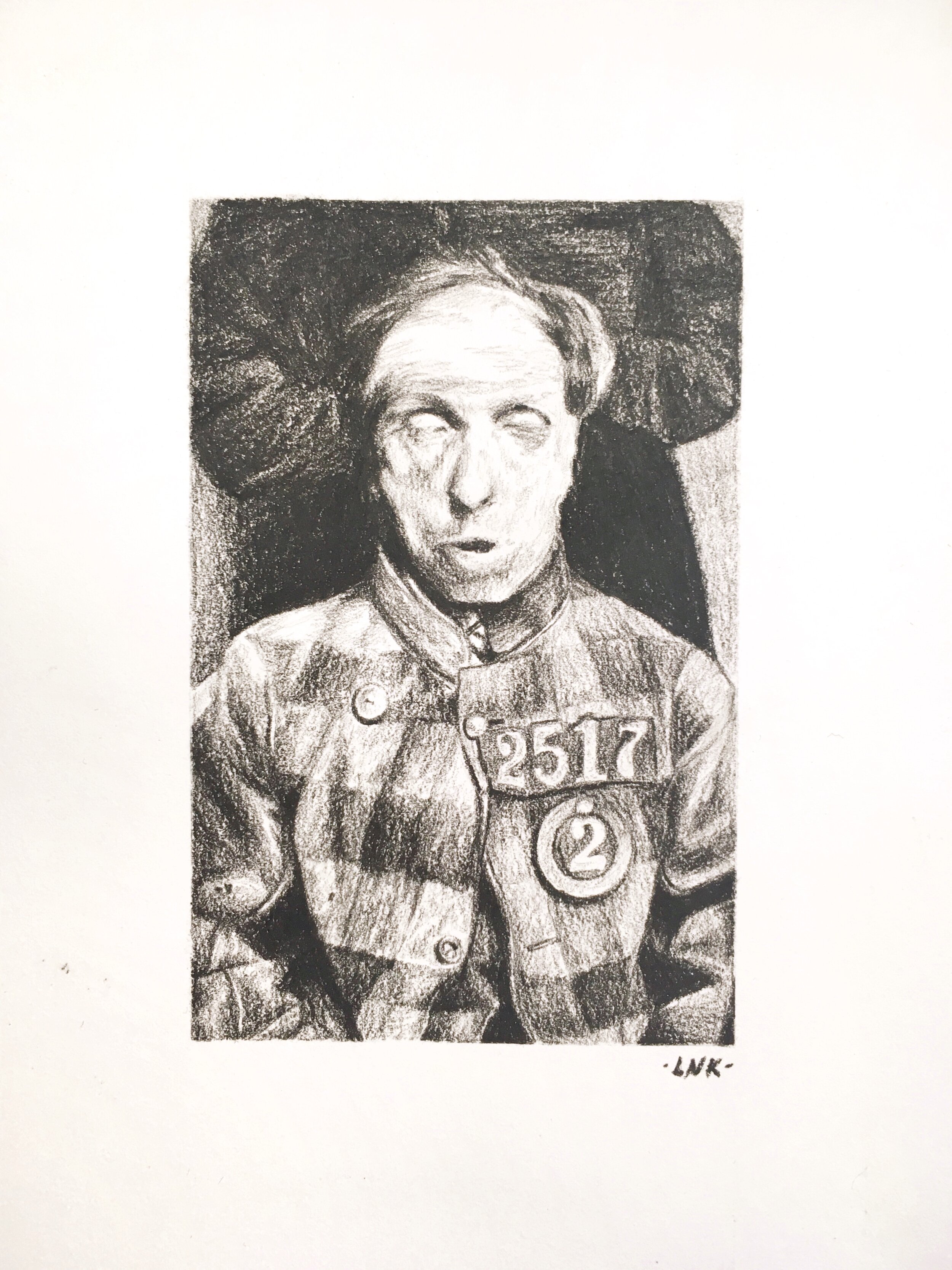
Mental health asylum portraits
by Linka Lipski
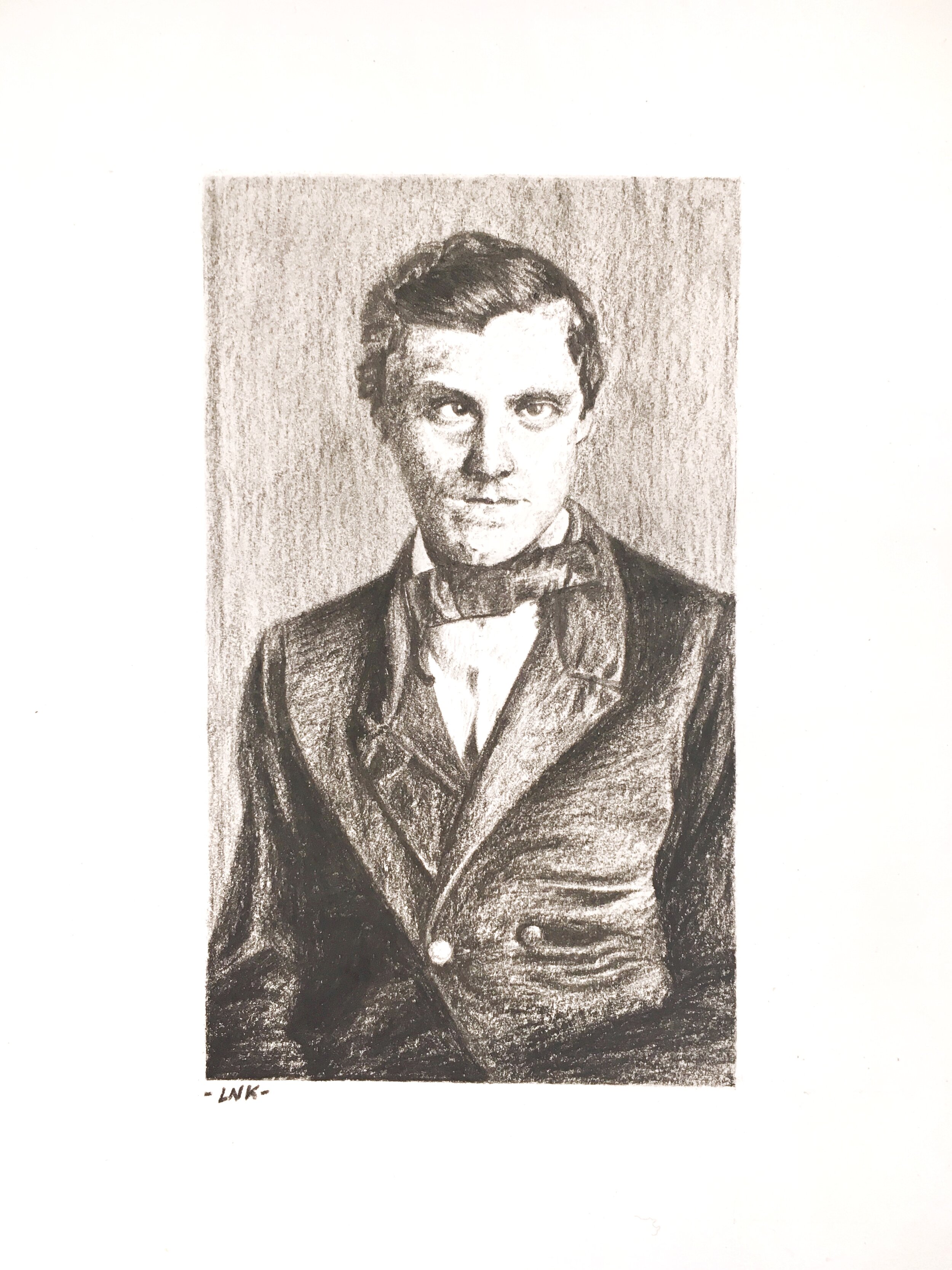
by Linka Lipski
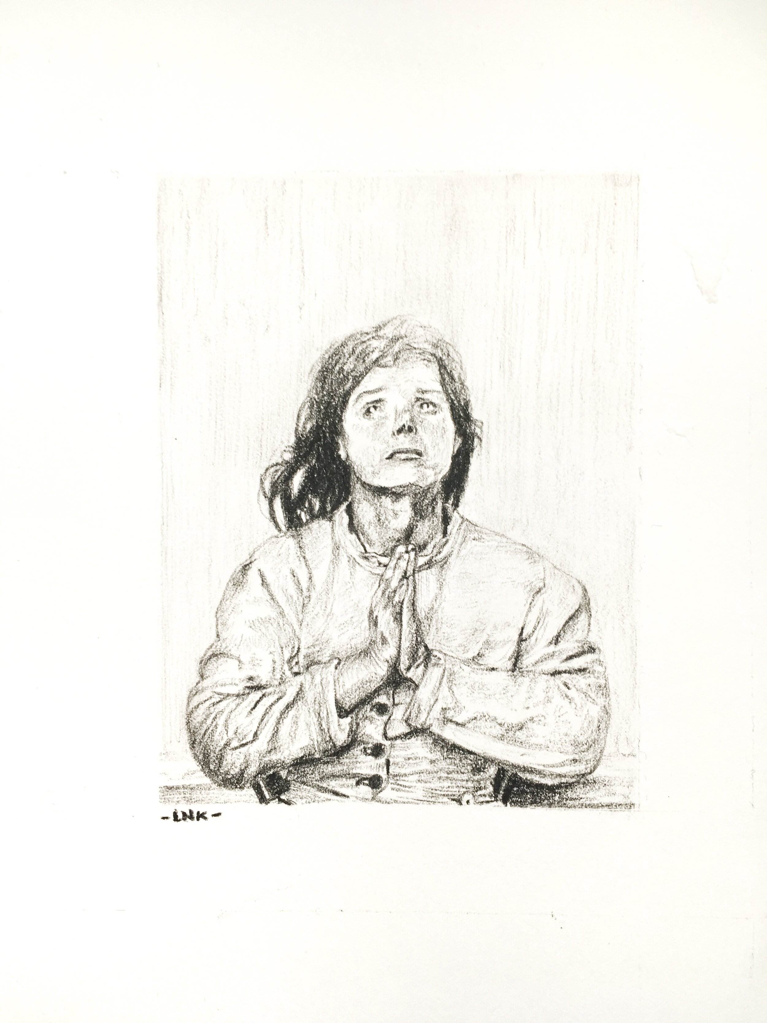
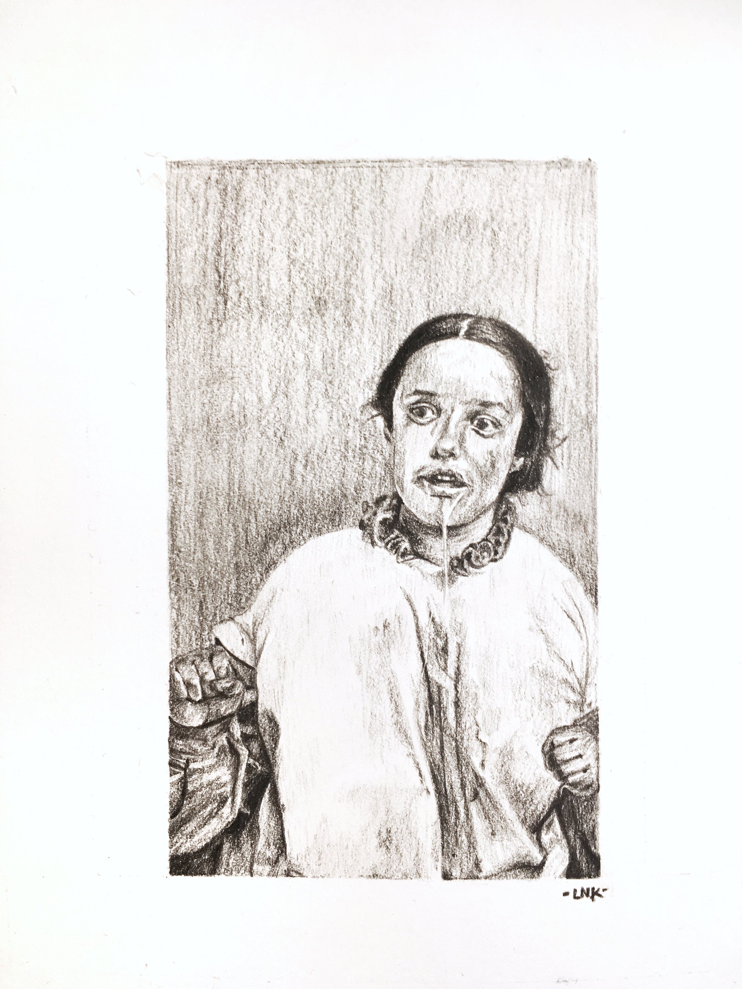
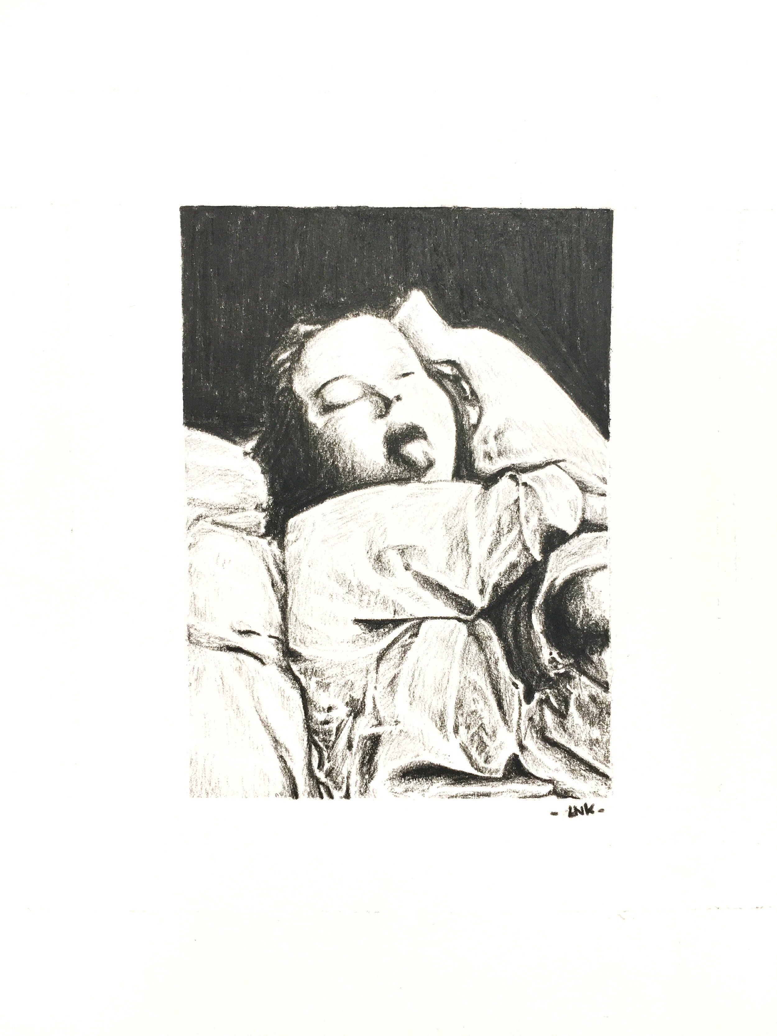
“These portraits are based on photographs of asylums patients in the 1800’s and early 1900’s which were used to illustrate medical narratives and diagnosis. It is often very hard to find information about these people. What were their names? Were they loved? Cared for as needed? By changing the nature of these portraits as art pieces in their own rights, I hope to change our perceptions. Will you wonder about them now?”
Linka Lipski works around themes of her personal trauma, mental health, and anatomical illustrations. The artist works with symbolism and composition to communicate difficult feelings, question them, or simply connect with a subconscious in need of expression.
Instagram: @linkalipski

Fox Forest
by Daniel Naranjo-Rodriguez
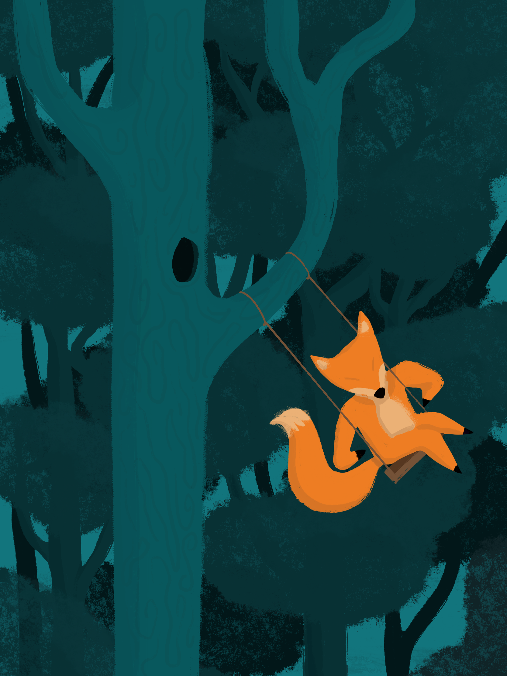
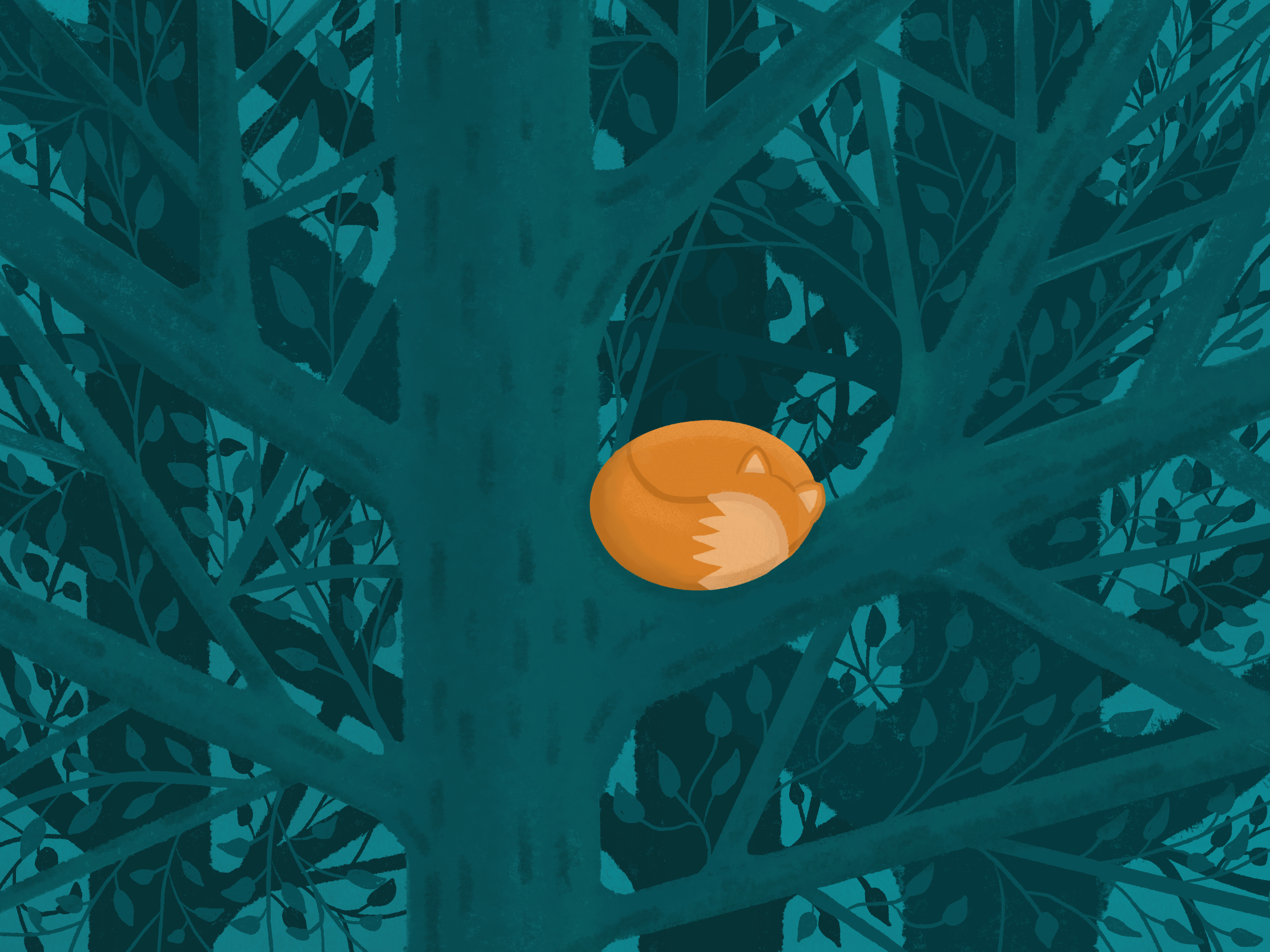
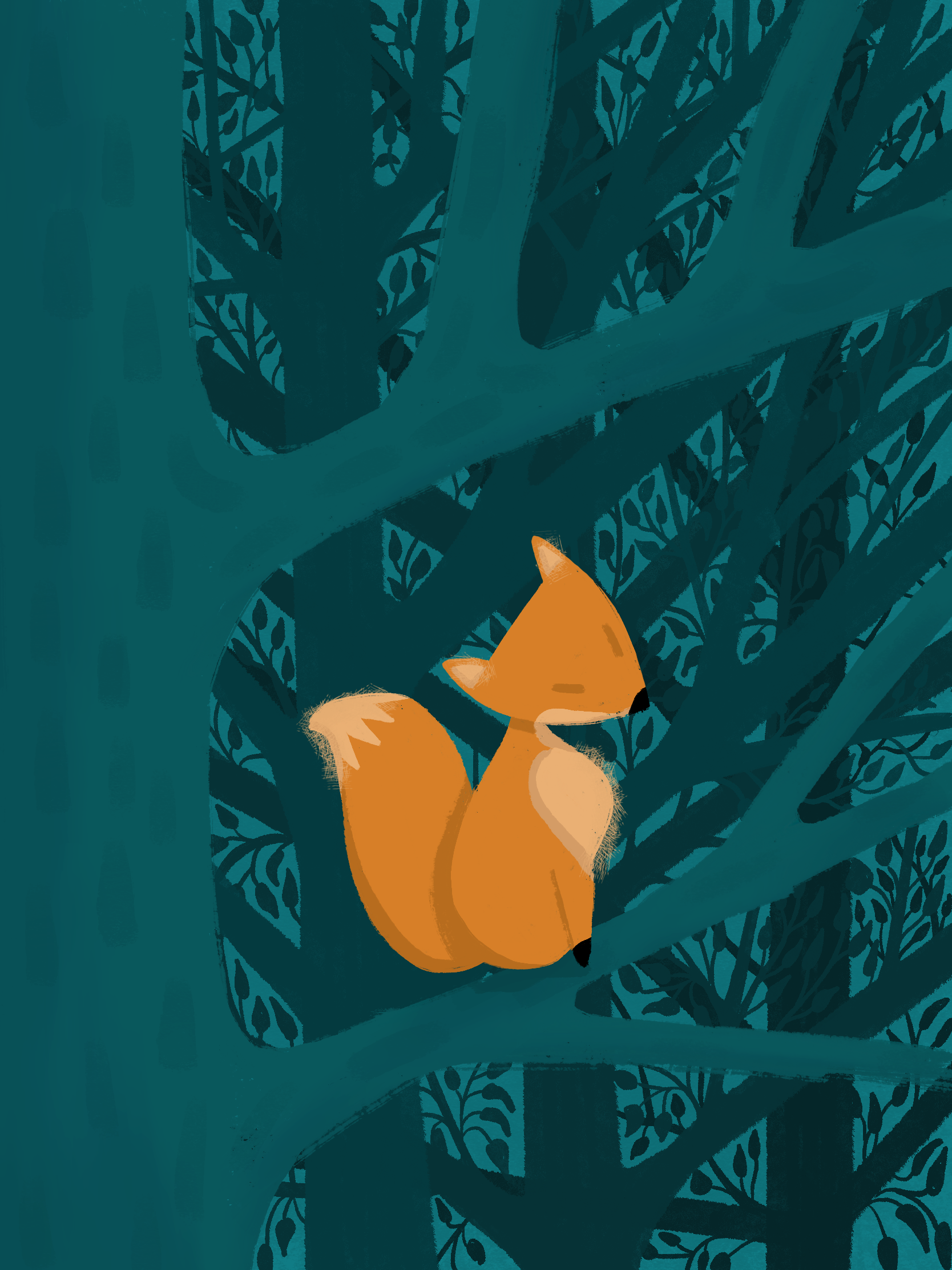
by Daniel Naranjo-Rodriguez
“This series of three illustrations explores different perspectives of a fox in the forest. It started as a study of texture, colour and tone, and developed into the three pieces.”
Daniel is an undergraduate media and communications student at Goldsmiths. He was born and raised in Colombia, where he discovered a passion for the visual arts and began making digital illustrations and home-made films. After he moved to the United Kingdom in 2013, he began pursuing a career in the film and television industry through different courses, placements and opportunities in the creative sector. He is currently in the last year of his university course and hopes to become a cinematographer.

Sherbs
by Jamie Taylor
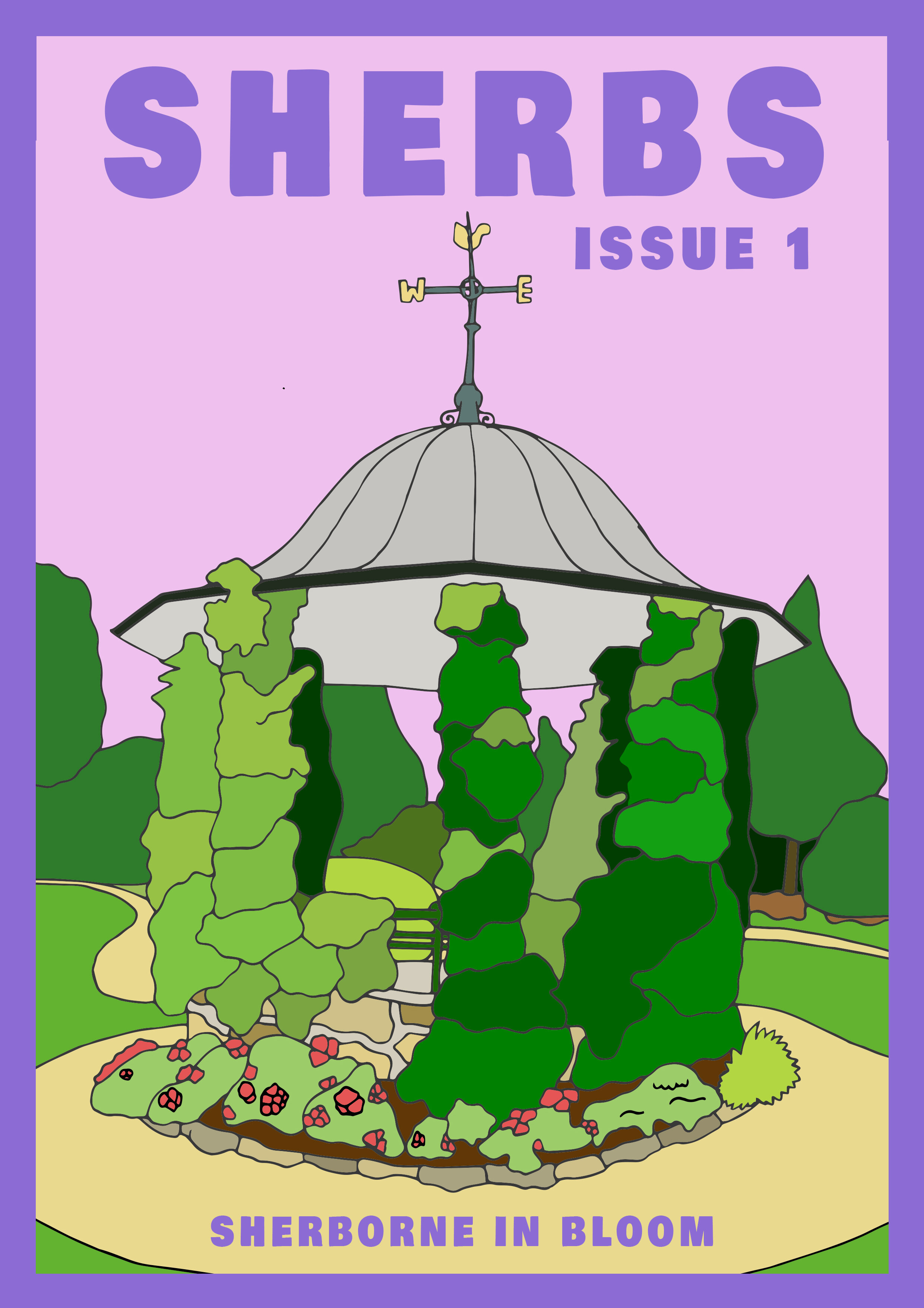
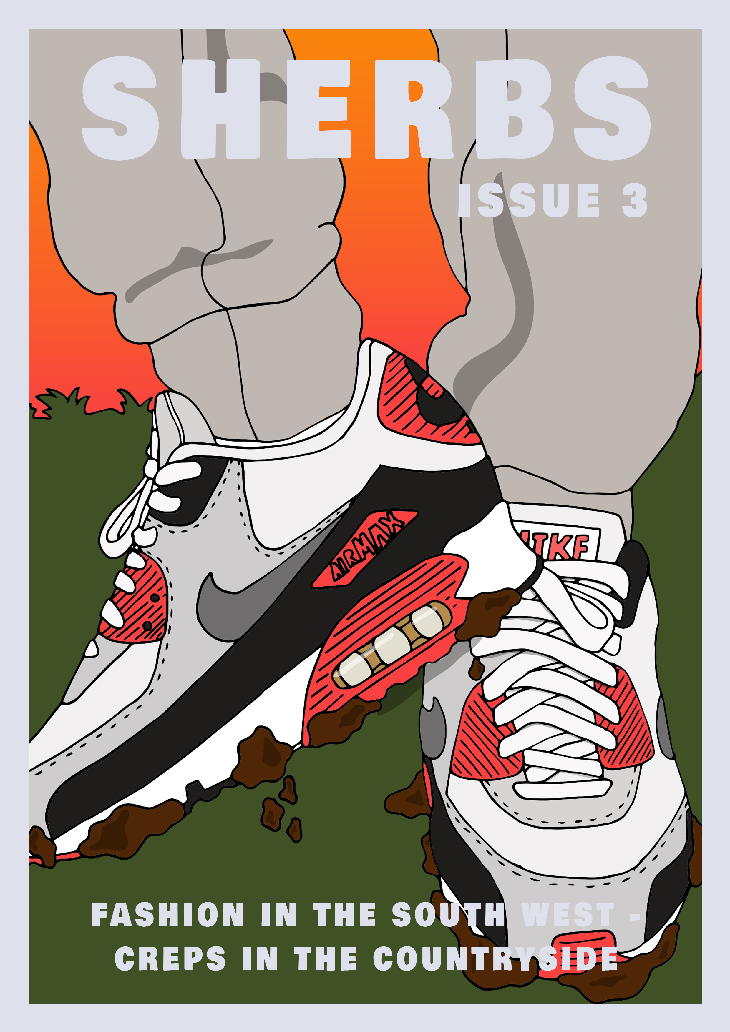
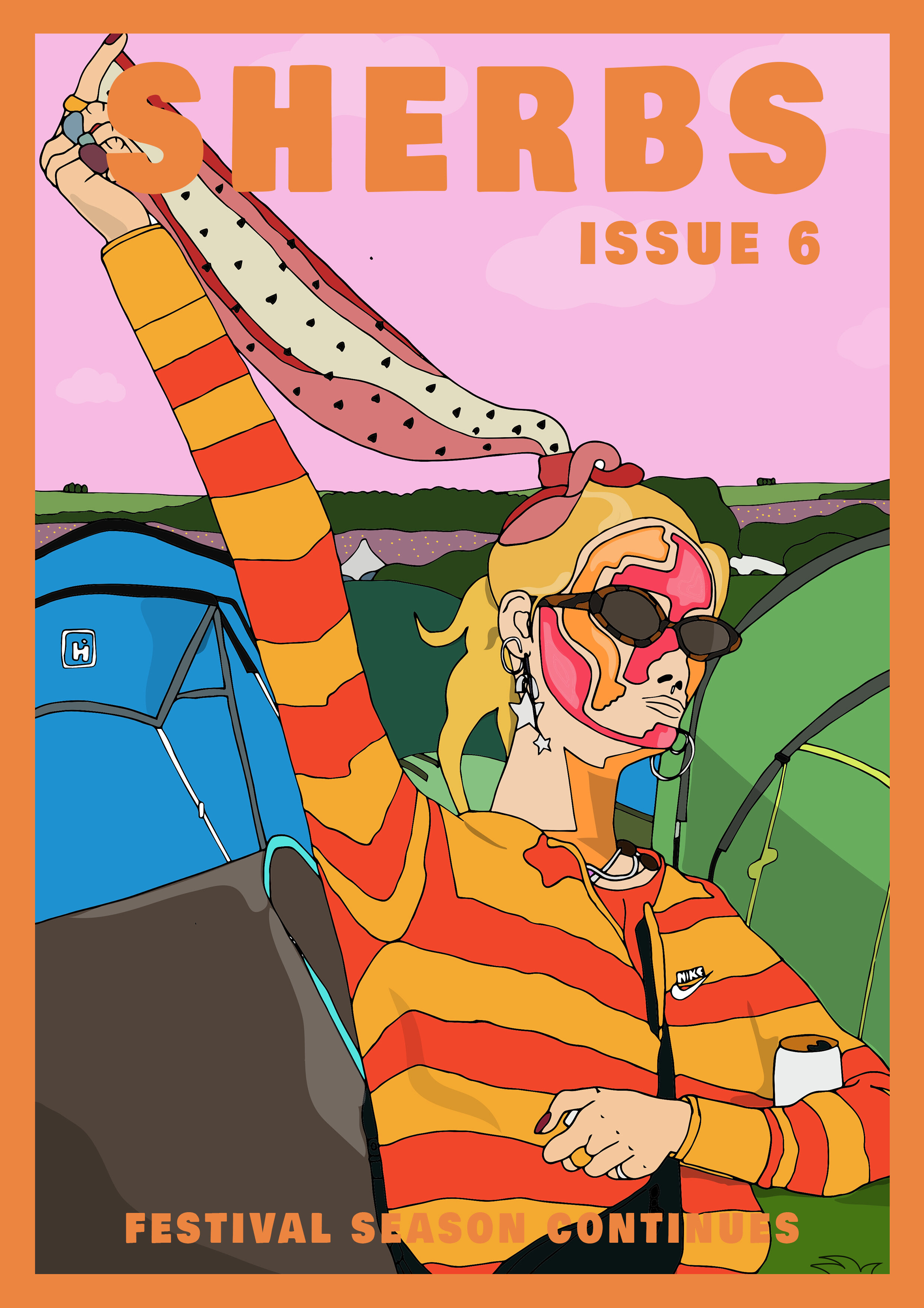
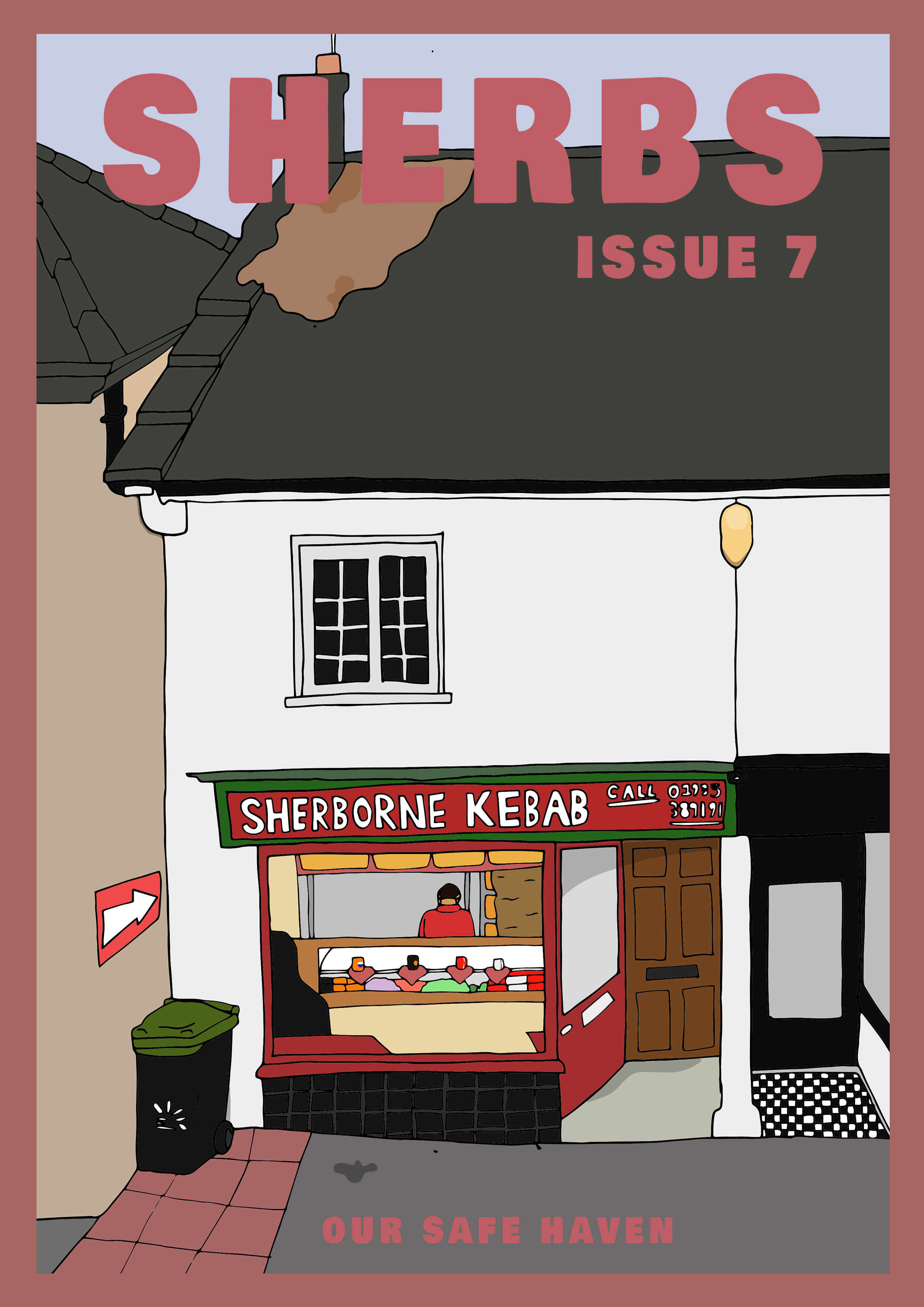
by Jamie Taylor
“ ‘Sherbs’, or Sherborne as it is formally known, is a picturesque town in Dorset, known for its historic abbey and possibly more historic people. In ‘Sherbs’ I wanted to show the side of Sherborne I see, from an almost disregarded adolescent perspective, not what is seen in The Sherborne Times or The Conduit Magazine. Using vibrant colours, I wanted to illustrate the more bustling side of life in Sherborne, a younger perspective, while also accommodating the architecture and landmarks that convey the town’s identity. I chose to draw the covers by hand but colour them digitally to give them a clean and lively aesthetic similar to magazines seen on shop shelves.”
Jamie grew up in the Somerset/ Dorset countryside before moving to London to study Media and Communication. From a young age, he always displayed an interest in design and university helped develop his ‘drawings’ into a more complete body of work. Despite loving life in London, the countryside has always been his home and proved to be the inspiration for his work. You can find more of his art here.

스물둘 (Twenty-two)
by Hyun Hwang
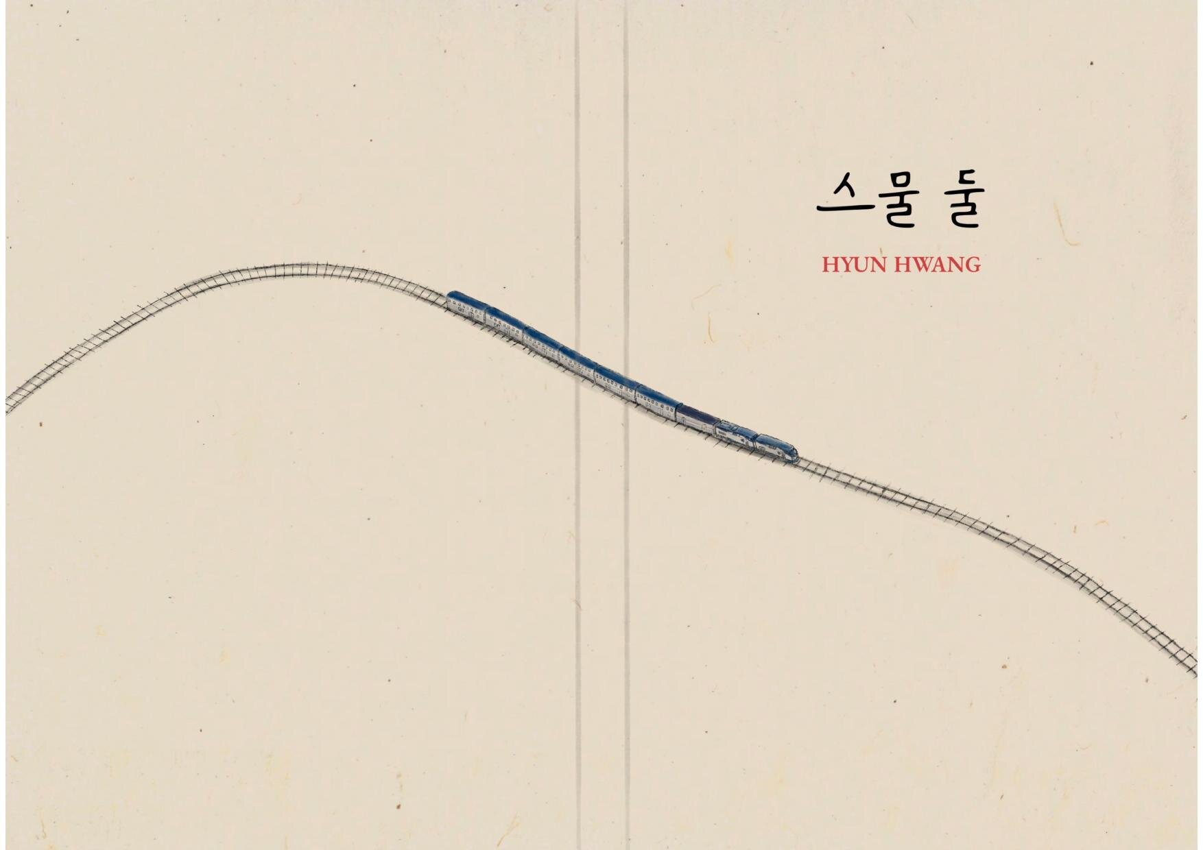
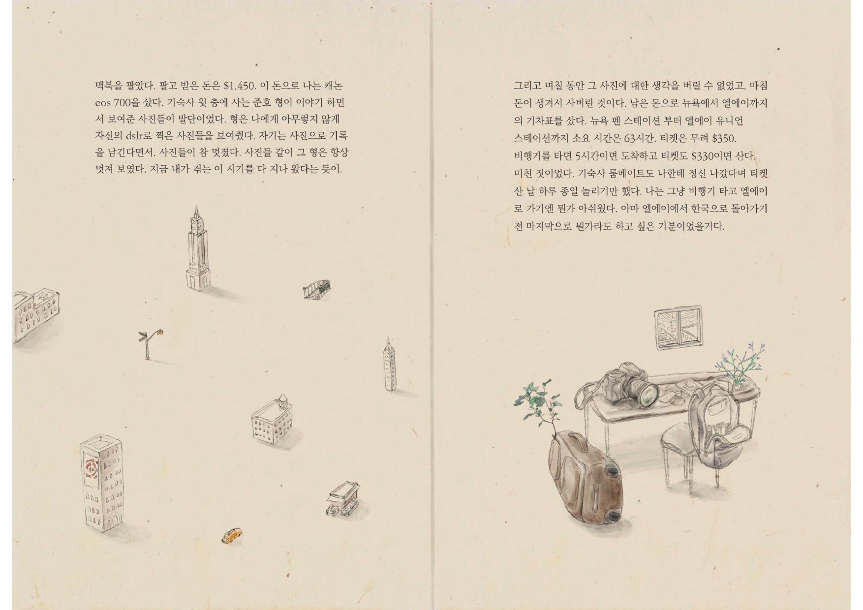
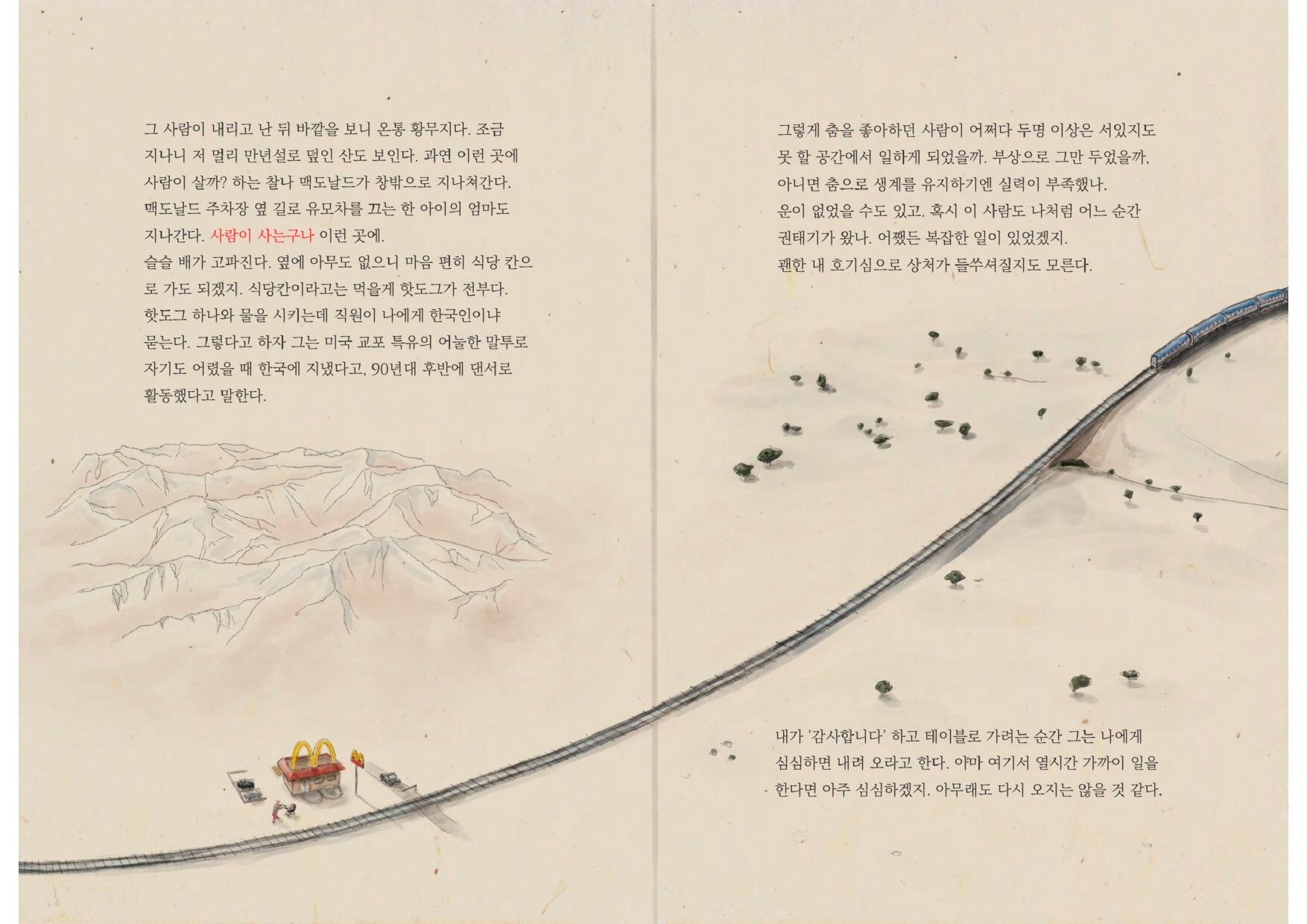
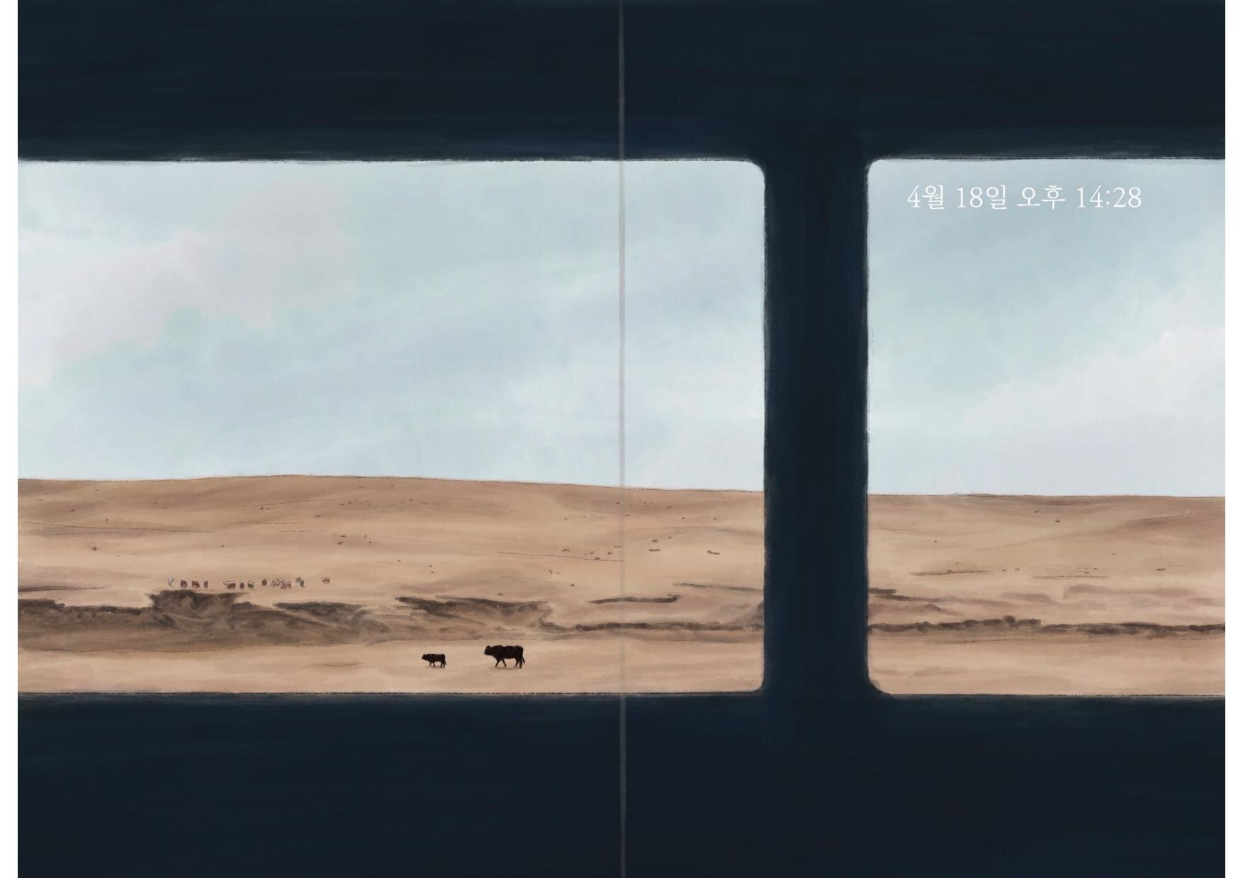
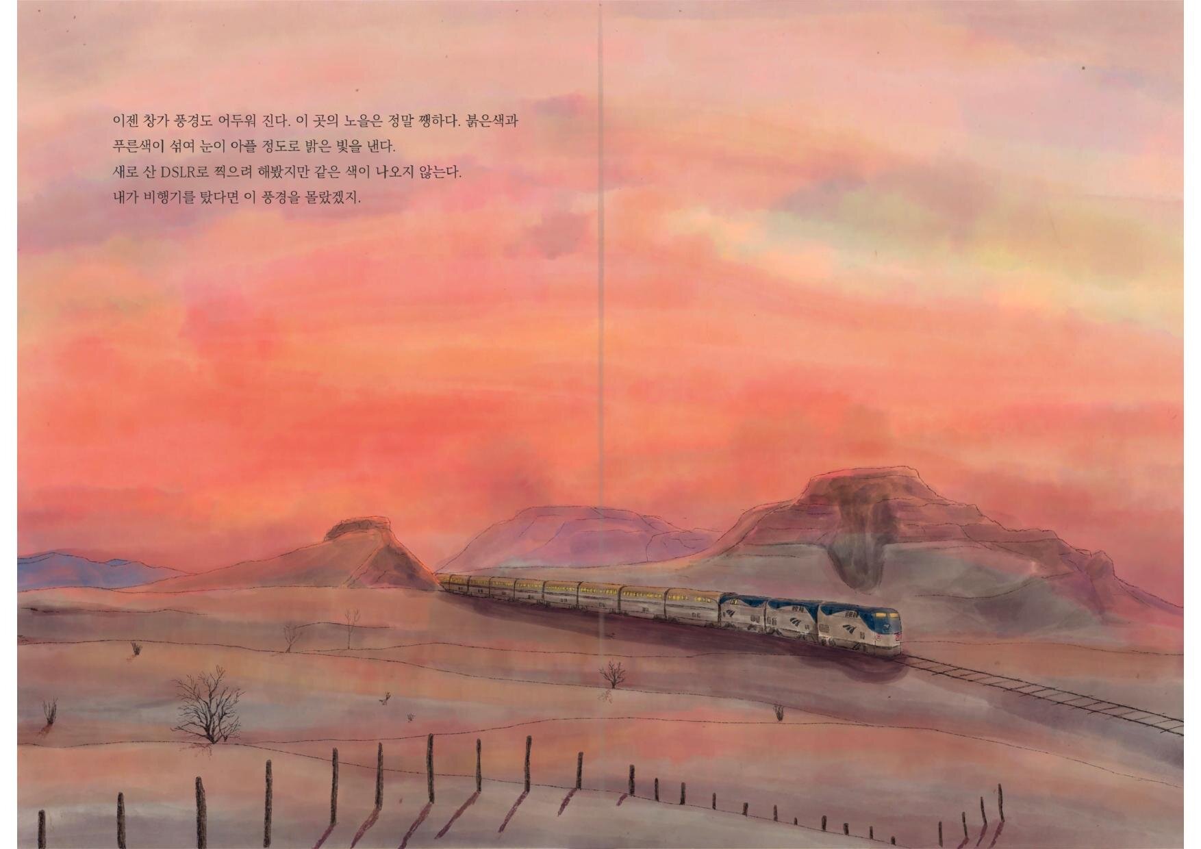
by Hyun Hwang
“The twenty-two project is a travel journal styled illustration book, based on a 63-hour train journey that I took across the USA when I was 22 years old. This talks and illustrates what I saw, experienced and thought about during this long train ride - and hence brings me back to my 22-year-old self.” For more images from this illustration book: @hyun_arts or hyunhwang.com.
Hyun Hwang is an illustrator from Seoul, South Korea. He is looking to graduate from his Bachelor’s Degree at Goldsmiths in 2020. Hyun has previously worked at a non-profit organisation called ‘Goodsted’ as an illustrator intern. Hyun is very excited to continue his career within art and is available for freelance projects. Check out his portfolio here: hyunhwang.com.

Guide to Vilnius (at night)
by Austeja Bukauskyte
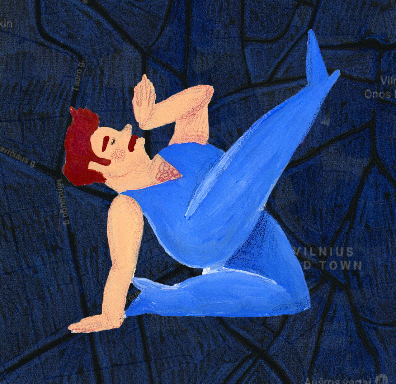
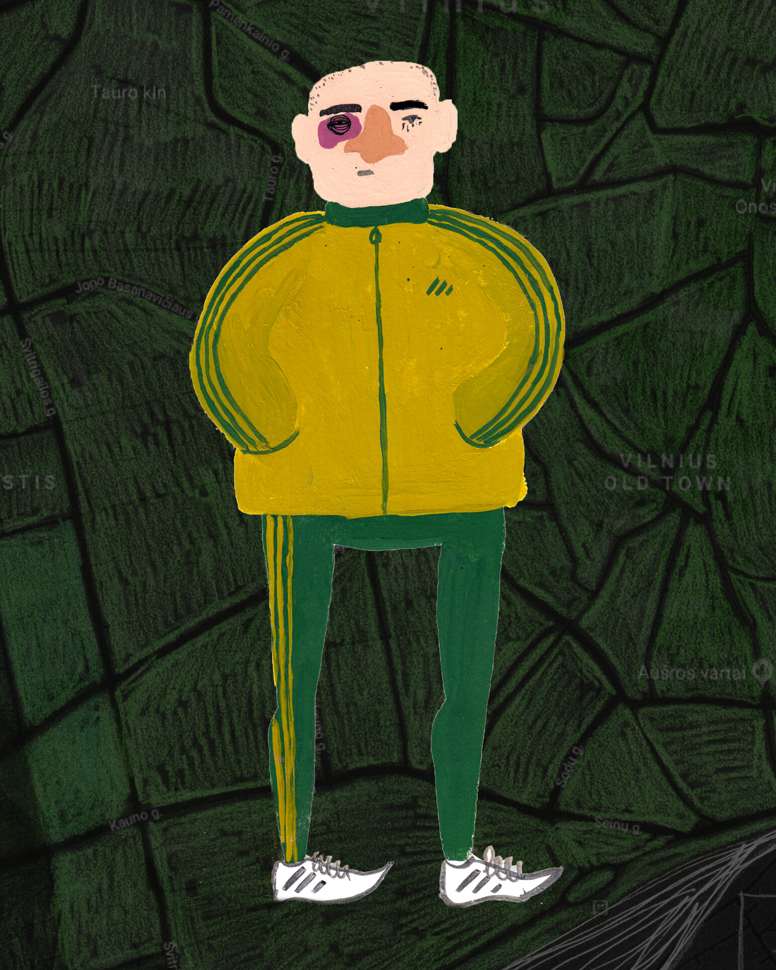
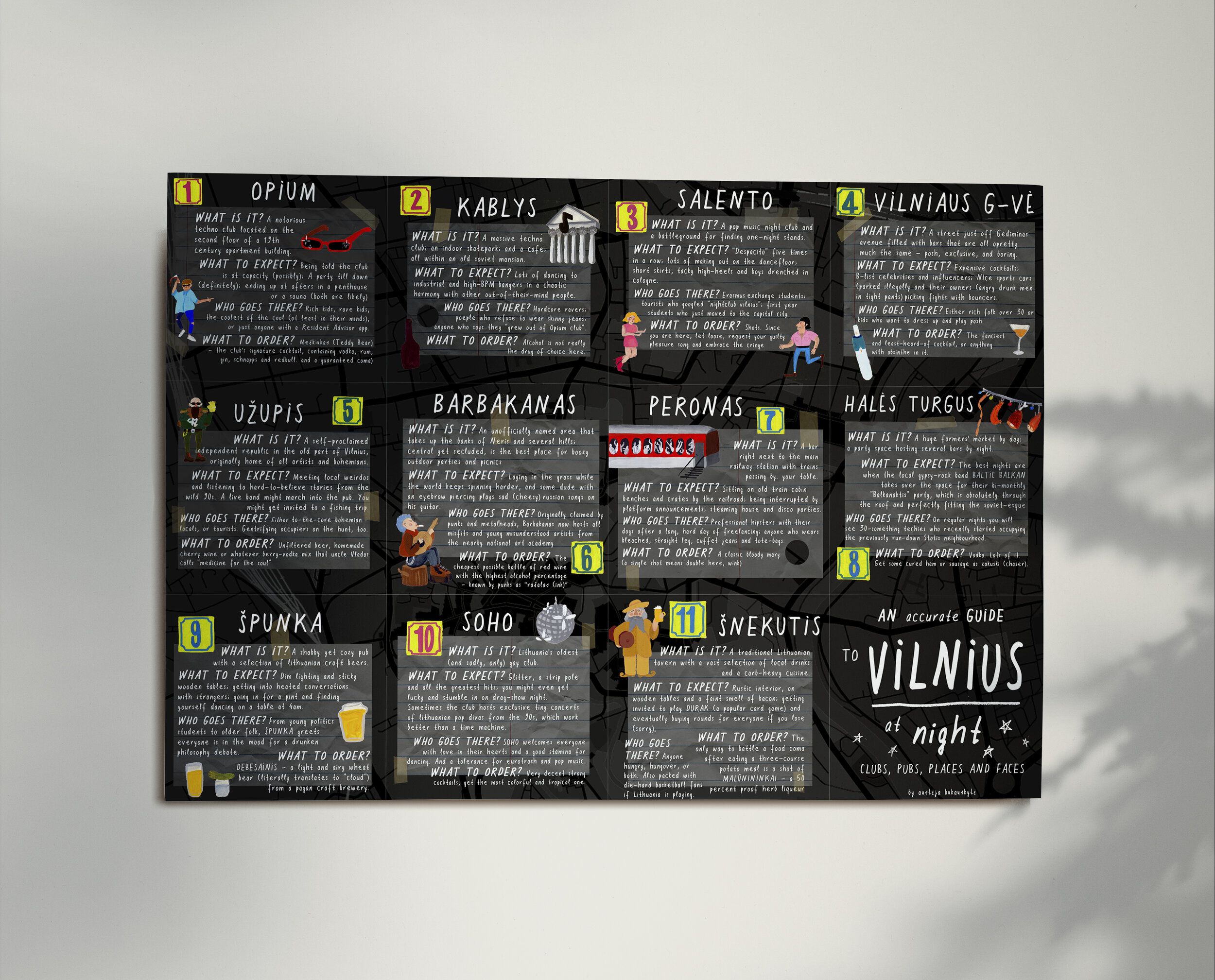
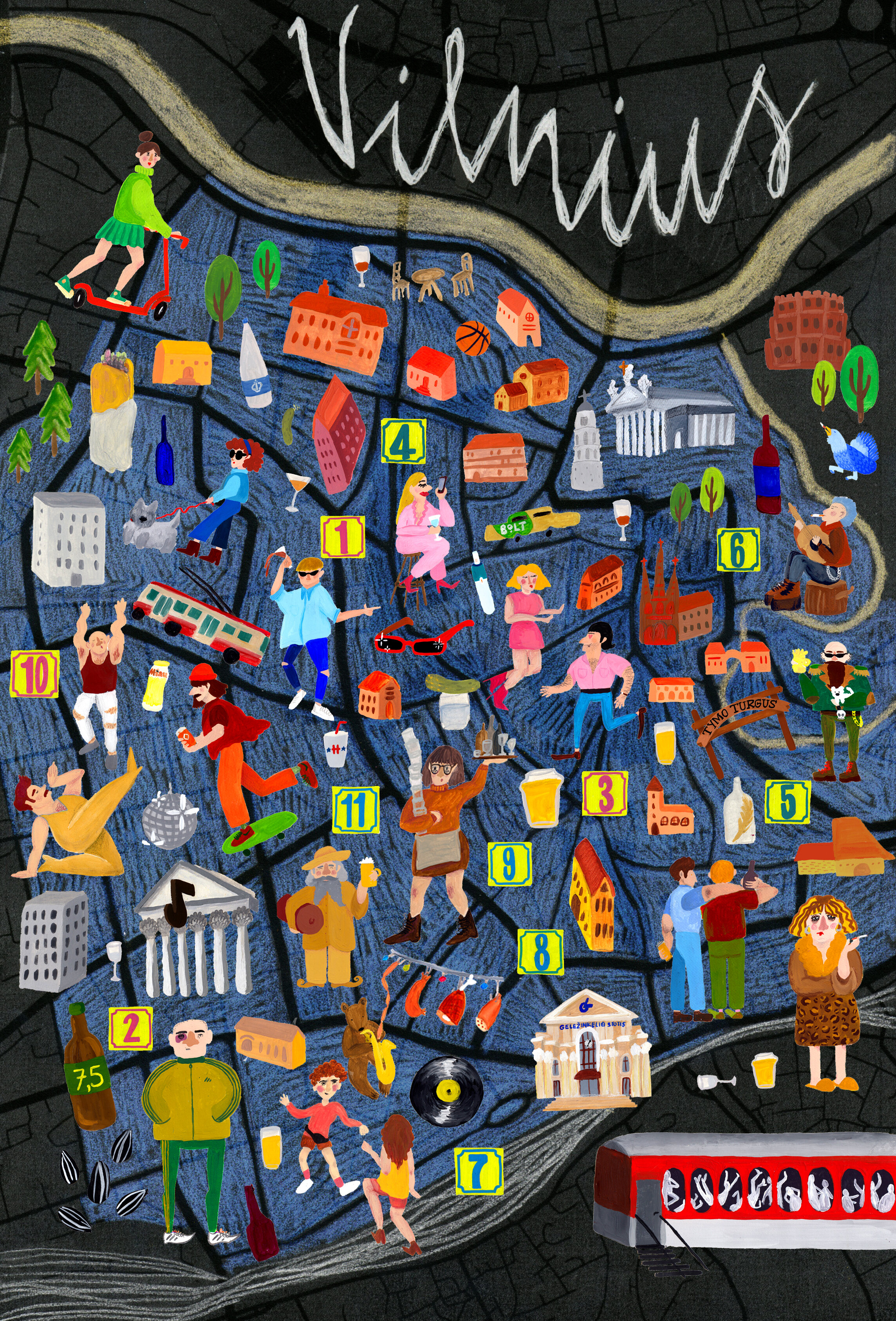
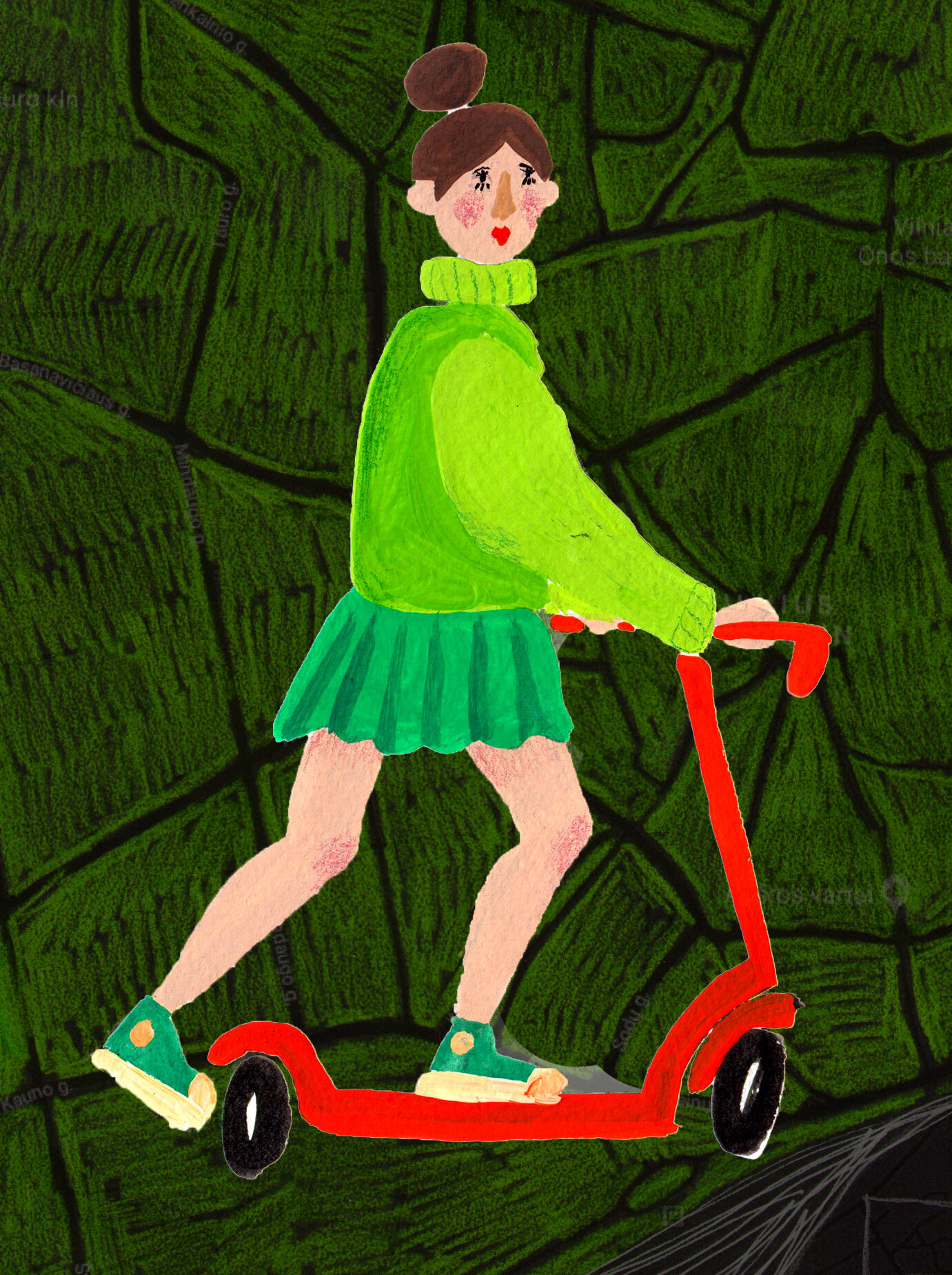
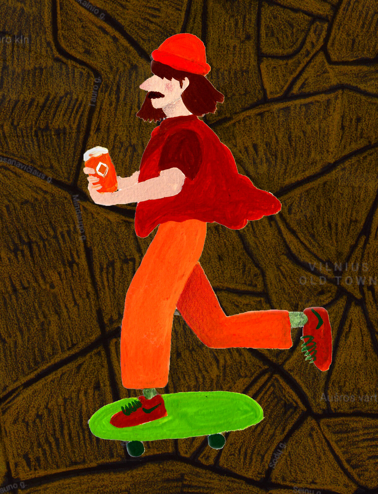
by Austeja Bukauskyte
“Being born and raised in Vilnius - a city with an amazing, yet-not-that-well-known-to-the-foreign-public party scene, I wanted to create my own nightlife guide; one that features places that me and my friends genuinely enjoy, all with specific atmospheres and audiences for different tastes or moods. The map fits well into your pocket as a go-to on a night out and also doubles as a poster, for you to remember the eccentric characters of Vilnius.”
Austeja is a recent Goldsmiths Media Comms graduate and an aspiring illustrator often found in either Vilnius or South London. She enjoys people-watching in bars, reading children’s books, and sometimes does tattoos in her kitchen. You can follow Austeja’s artwork and travel adventures on her Instagram @austetron.

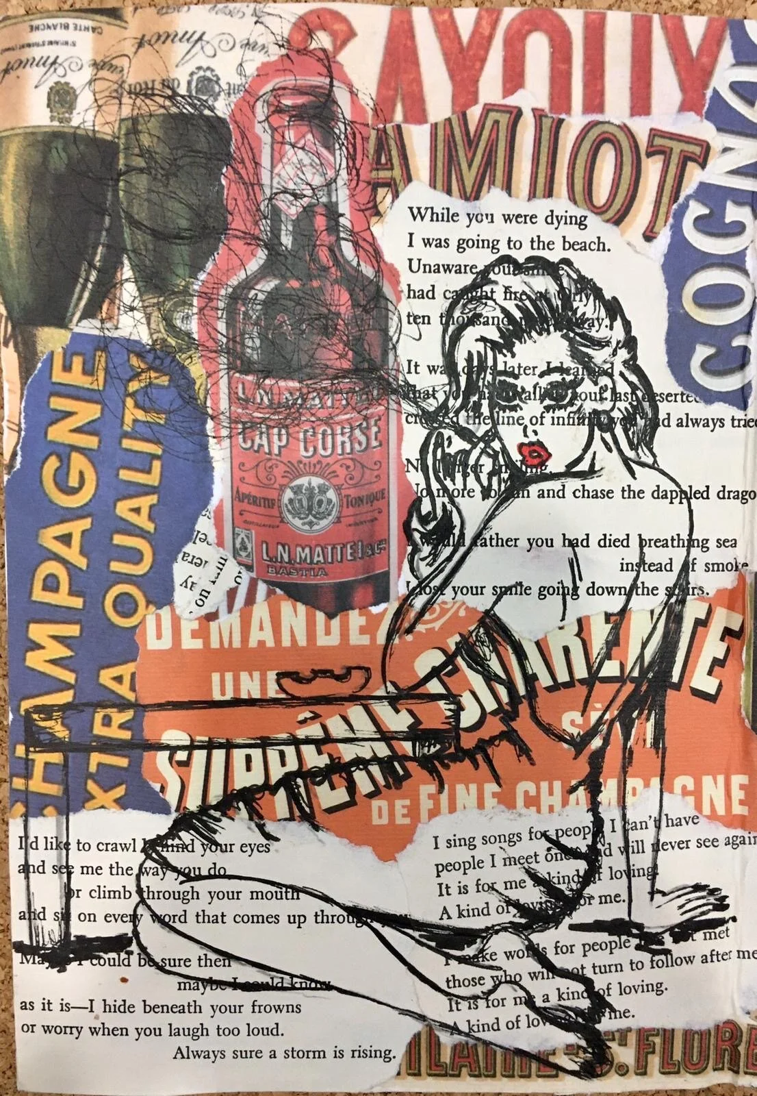
Whiskey Soaked & Loveless
by Alexandra Prentice
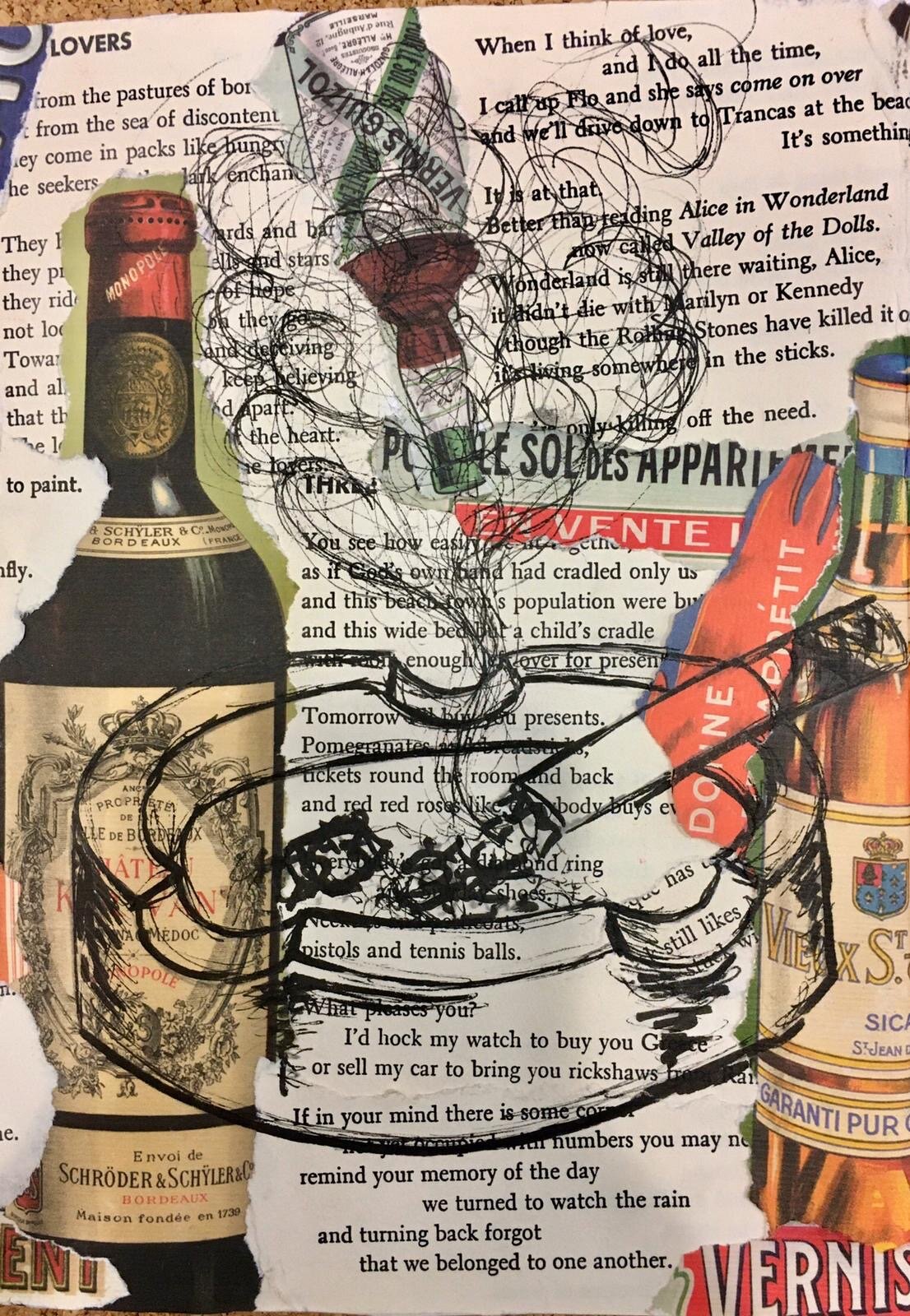
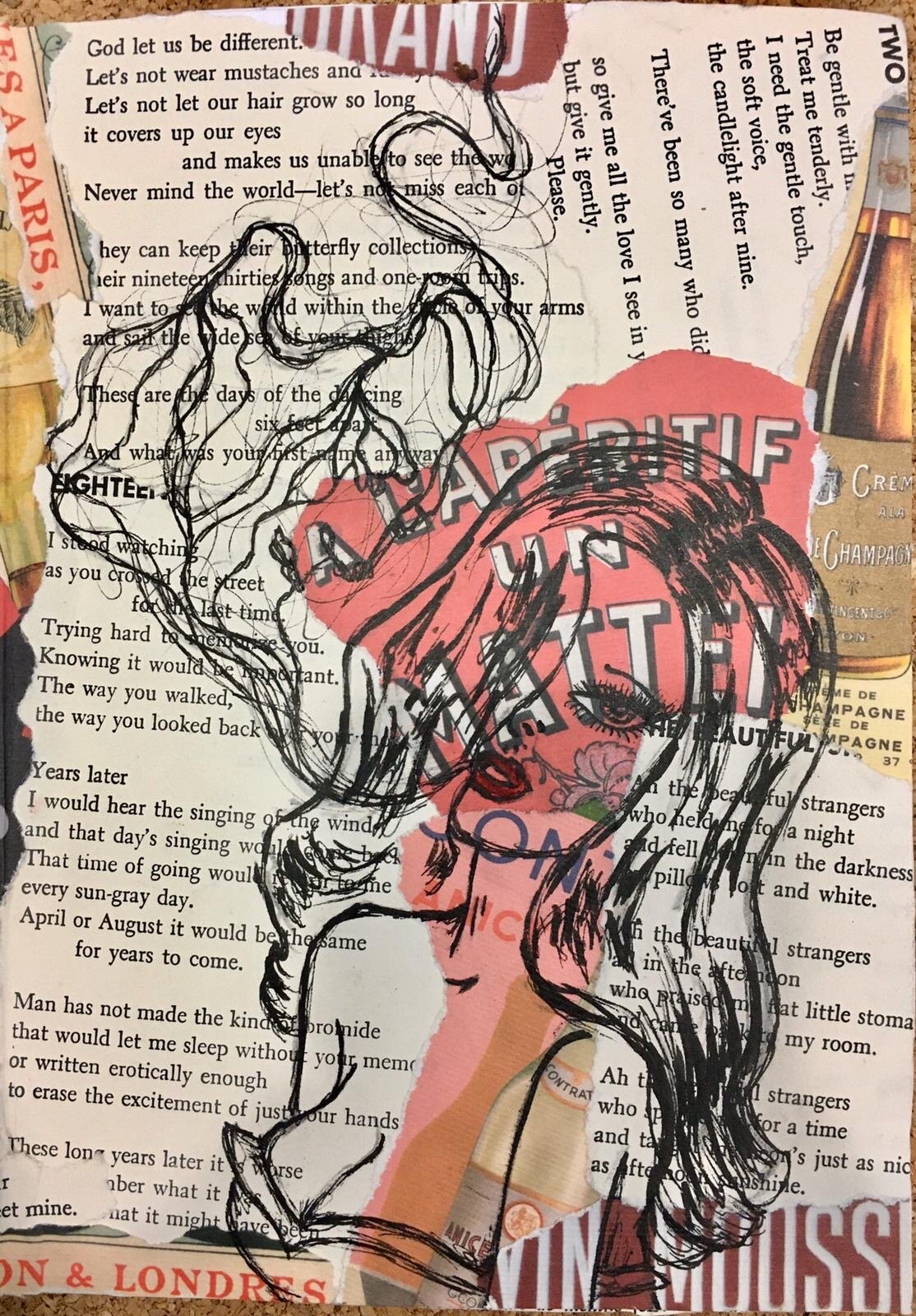
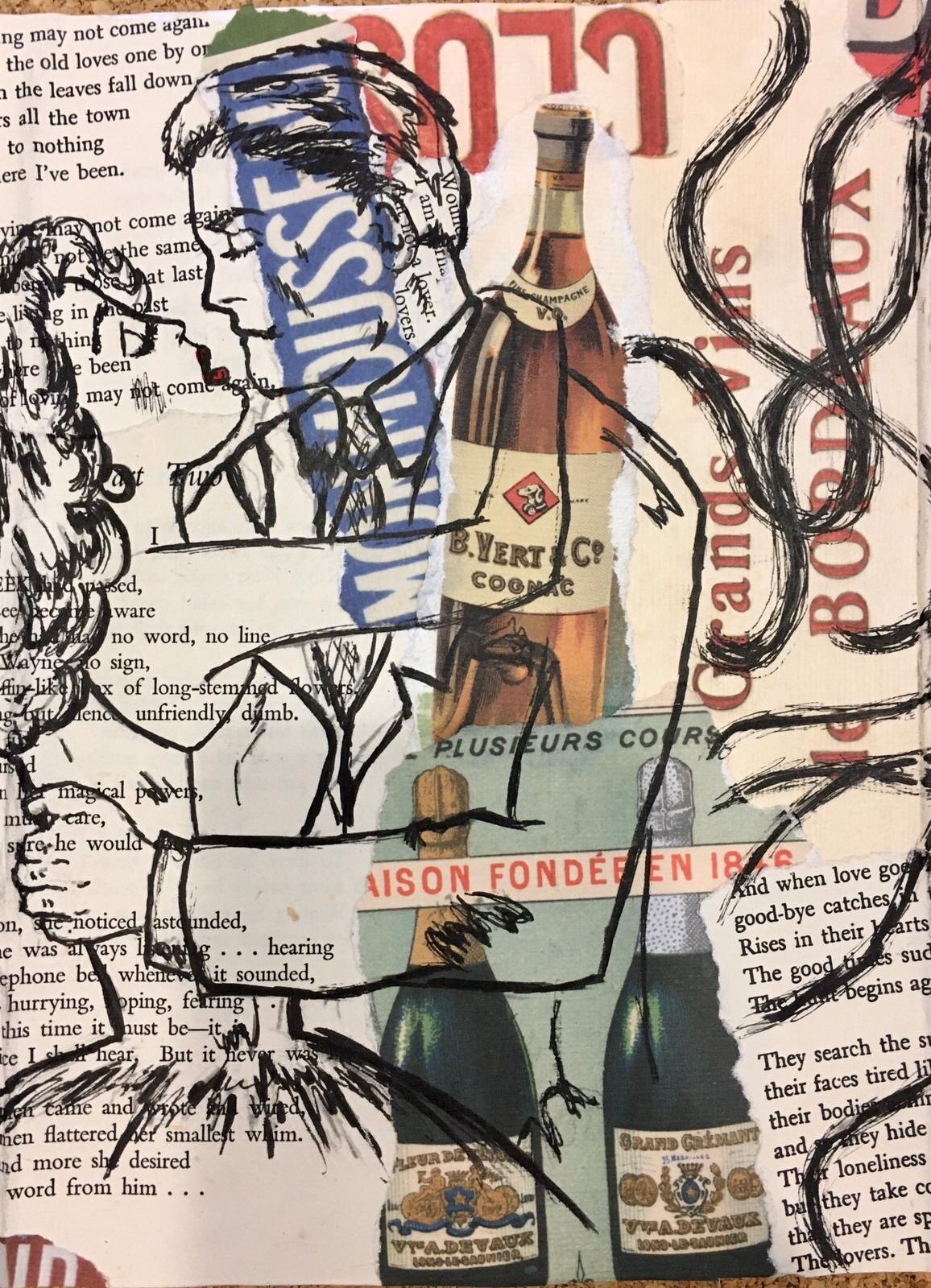
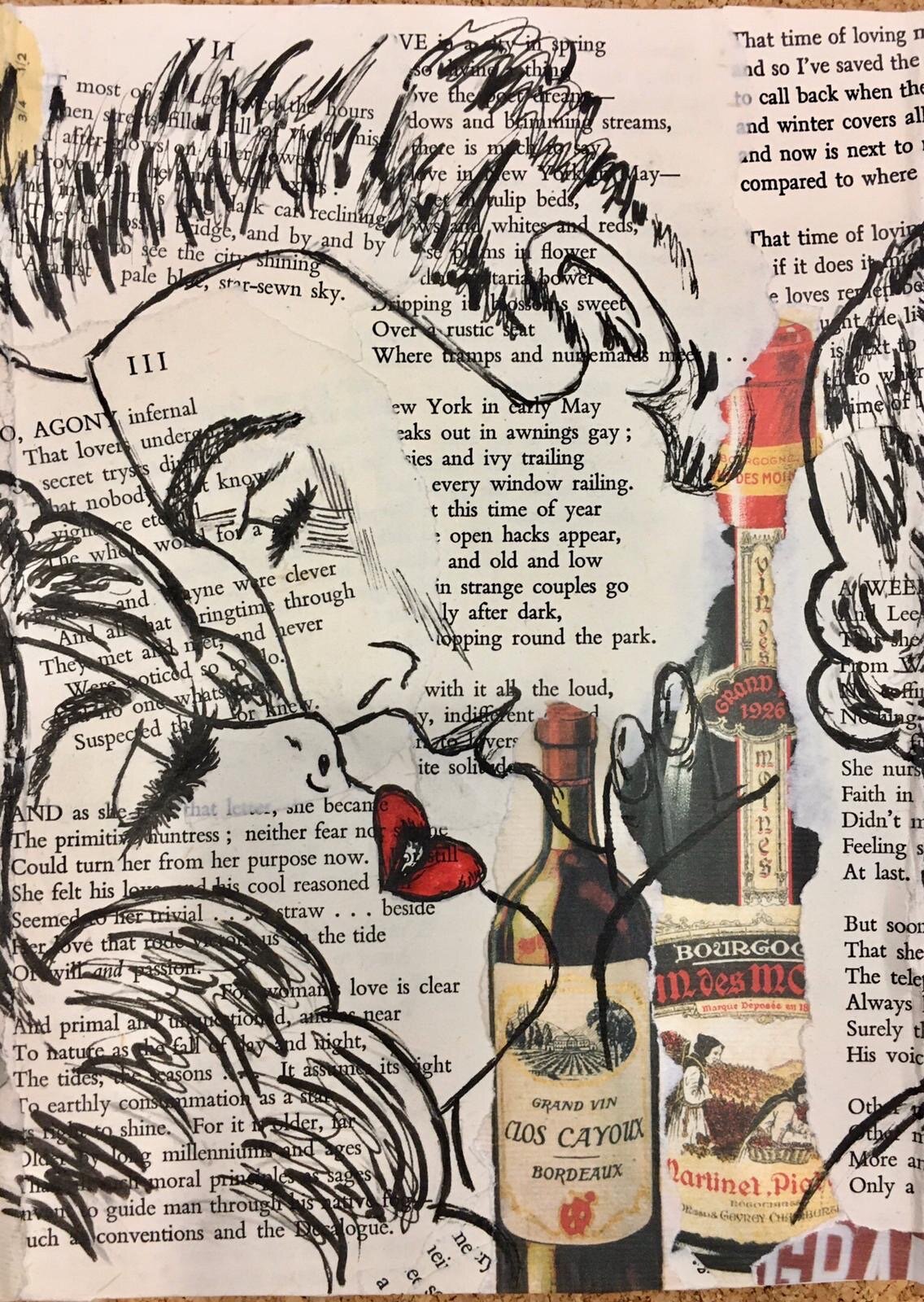
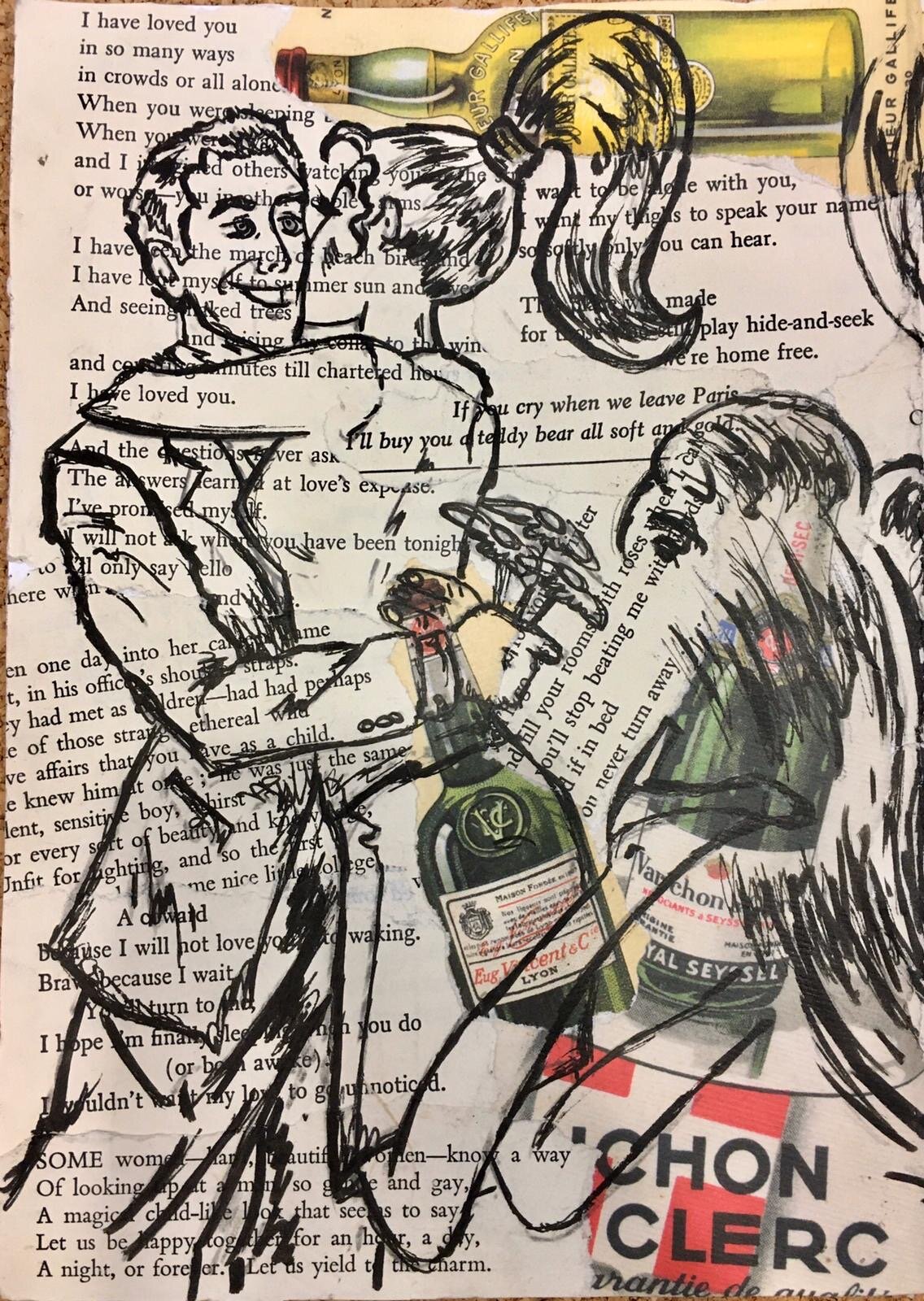
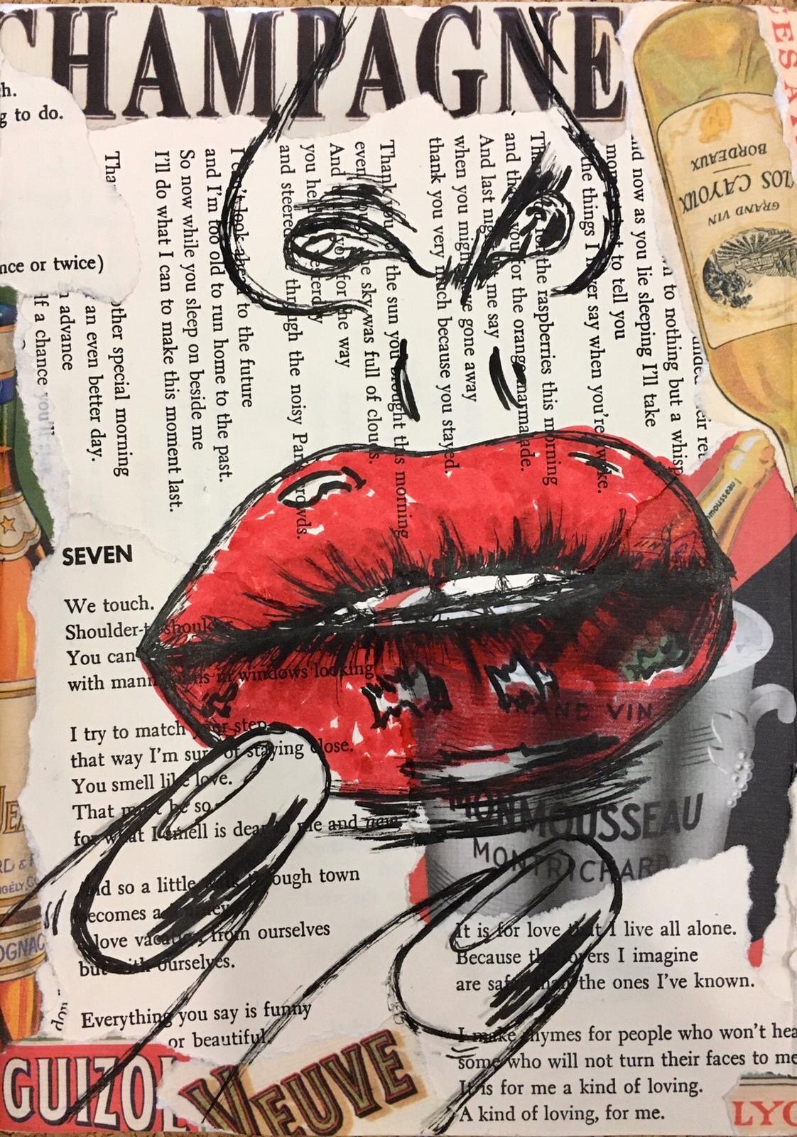
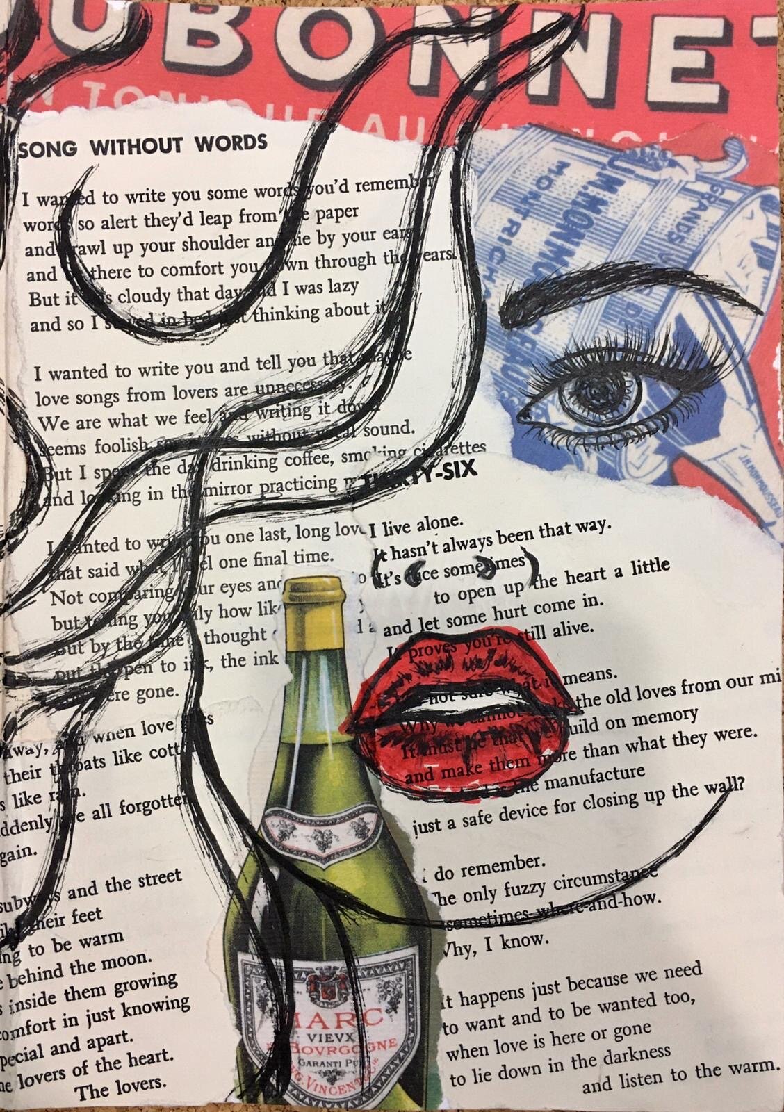
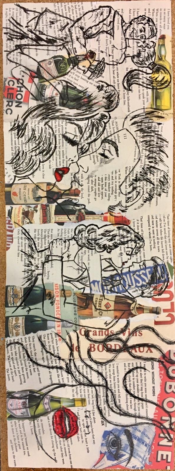
by Alexandra Prentice
“The illustrations began as a response to a brief given in the first section of the illustration module. It consisted of creating a piece of work that related to any of the series of words provided. The word chosen was “a ghost”. Alexandra wanted to transmit how memories of a relationship can creep up on you, much like ghosts do. She was inspired by the style of 80s comics and their nostalgic, dramatic and romantic look. She used love poems from old books and retro liquor labels to compose the background and add to the vintage feeling. Her intended result was to create the image of a whiskey-soaked, ruined romance.”
Alexandra Prentice is a Guatemalan 20-year-old student studying Media and Communications at Goldsmiths University. She is currently in her second year completing her illustration module which is where the work featured was completed. Prior to this, she had received art classes in Guatemala. She also enjoys sketching and analogue photography.

GRACE
by Hannah-Michelle Bayley
by Hannah-Michelle Bayley
As a 2015 Media and Communications Goldsmiths graduate I was fortunate enough to discover that I am utterly besotted with illustration. In the following autumn I enrolled on an MA course in illustration at Manchester School of Art and threw myself headfirst into image making. When I graduated from MSA I felt that familiar jarring sensation of, ‘oh, what do I do now?’. During my Masters degree, I felt a certain level of validation concerning my actions. I completely renovated a disused cellar space with a serious mould problem into an actual functioning gallery space on a shoestring. I took part in collaborations, submitted work to shows and painted murals in a train station, but all of that was under the structure of a university course. Suddenly, the realities of phone bills, car insurance and Netflix subscriptions were clawing at my purse; my desire to pursue illustration seemed insignificant. I faced a bizarre dichotomy in the face of employment as I was informed I was over qualified for multiple minimum wage jobs, but did not have the 25+ years employment experience and three degrees ‘required’ for higher paid pursuits. It was at that point that I decided that if I couldn’t find a job to fit my rather niche skill set I would have to craft one for myself. I now freelance and run my own online shop selling my illustrations and hand crafted goods.
I am incredibly inspired by colour. I use the Photoshop dropper tool to create my own digital pallets from found images online that I later use as reference when I paint. Many of my illustrations have an element of pink running through them. As an MA student I was intrigued by the aversion people have toward pink, both in the art world and in everyday life. The colour pink is often associated with shallowness, a lack of depth and weakness. Worryingly, these connotations are harnessed as criticism for those who adopt pink in their clothing, make up and creations. I use pink throughout my work as a re-appropriated symbol of strength and female solidarity.
For those of you reading this as current students or soon to be graduates I implore you not to give up. If you are like me and discover your true ability during your time at Goldsmiths, cling on to it and weave it into your daily routine. Start small and commit to what you want to do. Even if you assign one hour every other night you are moving in the right direction. It’s to easy to look at creatives on Instagram with 100K followers paired with an endless stream of portfolio perfection and brandish your own attempts as futile. I can completely empathise with this, but hiding your work from the world for fear of talking to an empty room will not land you the career you deserve. I am in this process myself and am perpetually paranoid that I’m simply making a fool of myself. As clichéd as it may sound, the only real way that you can fail at being creative is if you stop creating and sharing.
To find out more about Hannah's work, take a look at her Instagram site and Etsy shop.
EMAIL: cardihanstudios@gmail.com
Instagram : @cardihanstudios
Etsy: https://www.etsy.com/shop/cardihanstudios
Wells Blog
Duis mollis, est non commodo luctus, nisi erat porttitor ligula, eget lacinia odio sem nec elit. Maecenas faucibus mollis interdum. Nulla vitae elit libero, a pharetra augue.